
Objective
ABQ (Albuquerque) CDL Training is a truck driving school powered by CNM Ingenuity. CNM Ingenuity is a nonprofit that helps Central New Mexico Community College (CNM) pursue cooperative ventures in technology, entrepreneurship, and provides skills training. ABQ CDL Training reached out to the Marketing & Communications Office (MCO) at CNM, in need of a new brand strategy. Our objective was to increase the brand recognition of ABQ CDL Training across New Mexico. Our goal was to create a comprehensive marketing strategy that creates cohesive messaging paired with an effective visual identity that connects with a resourceful, adventurous, and brave customer base.
Project Scope
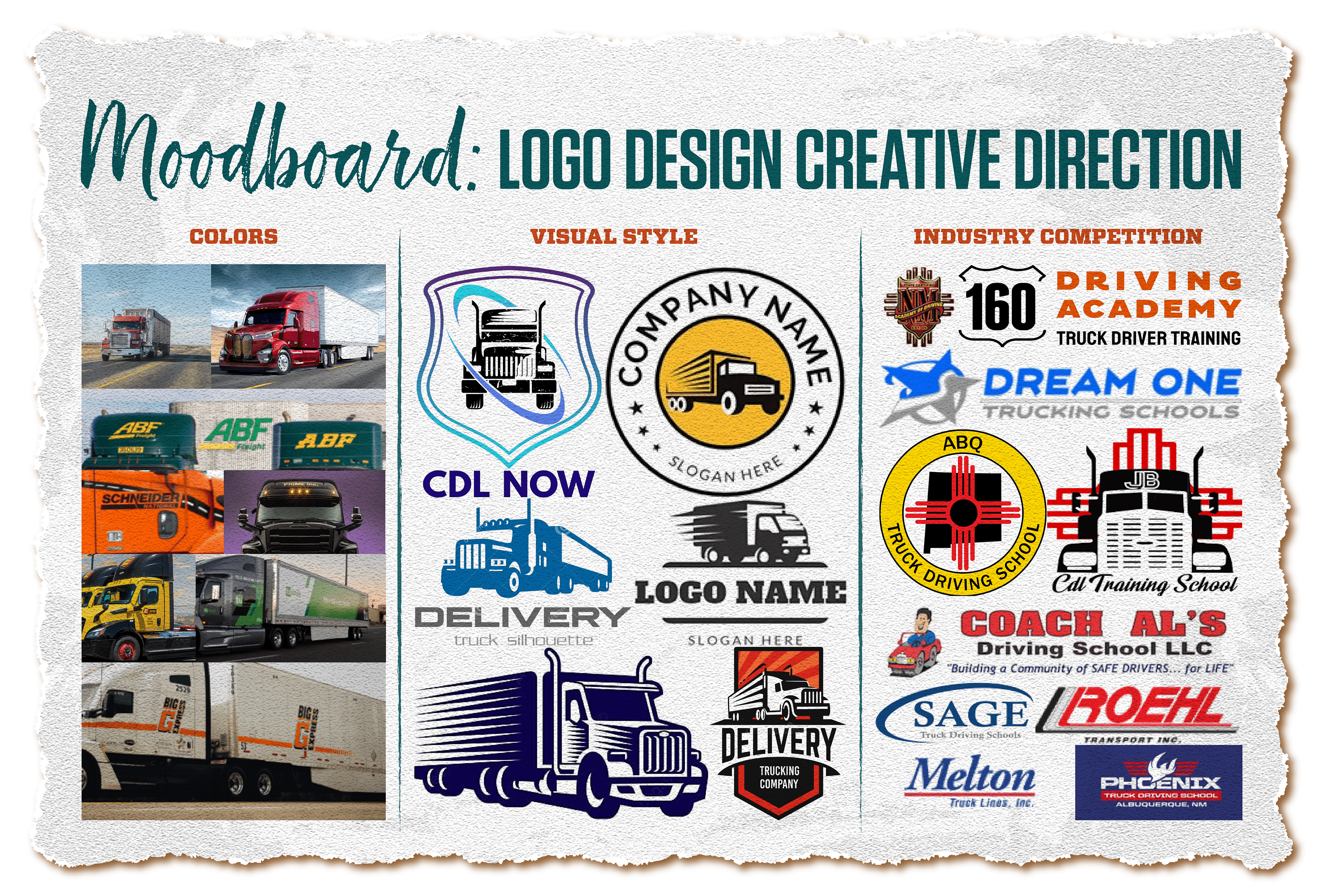
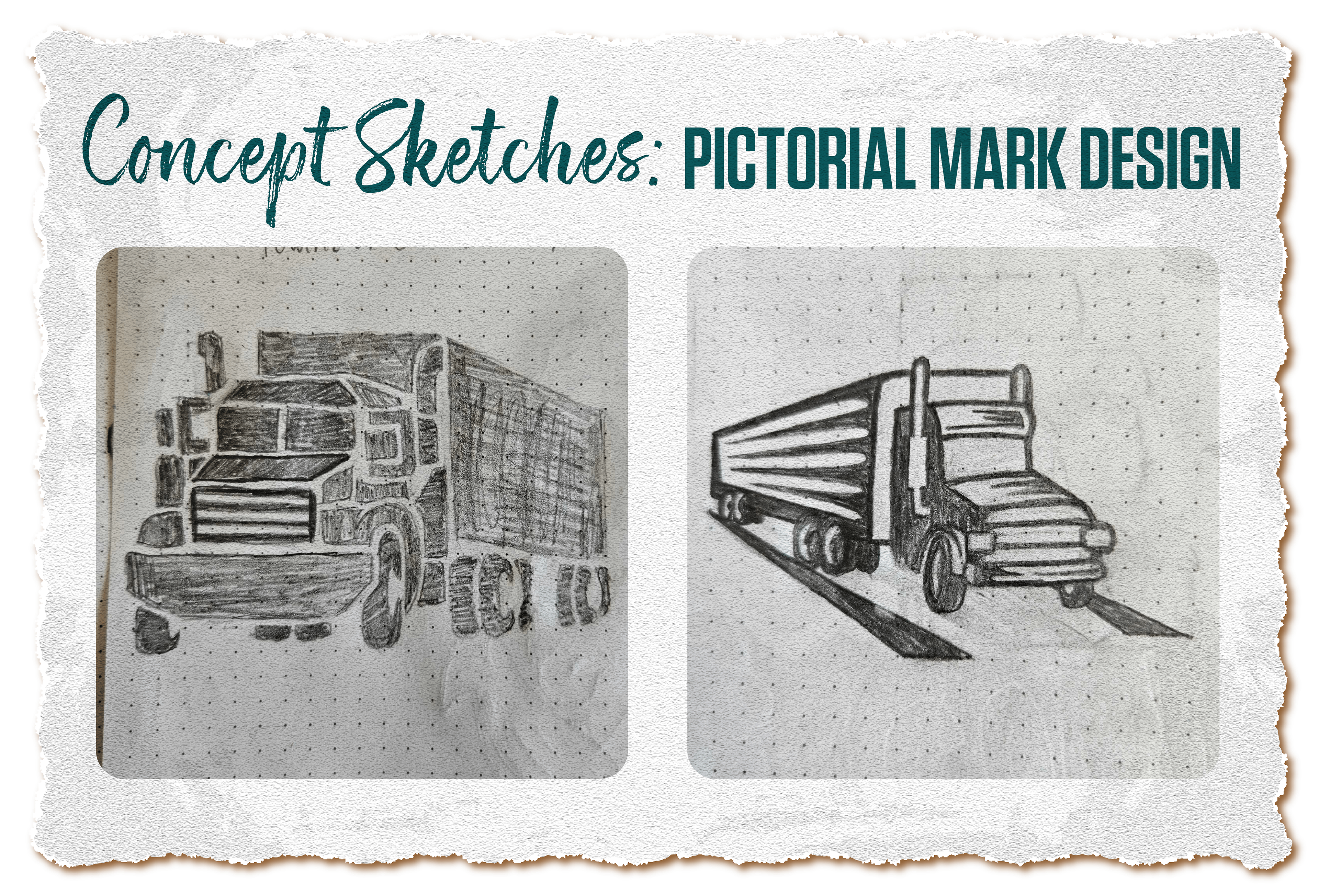
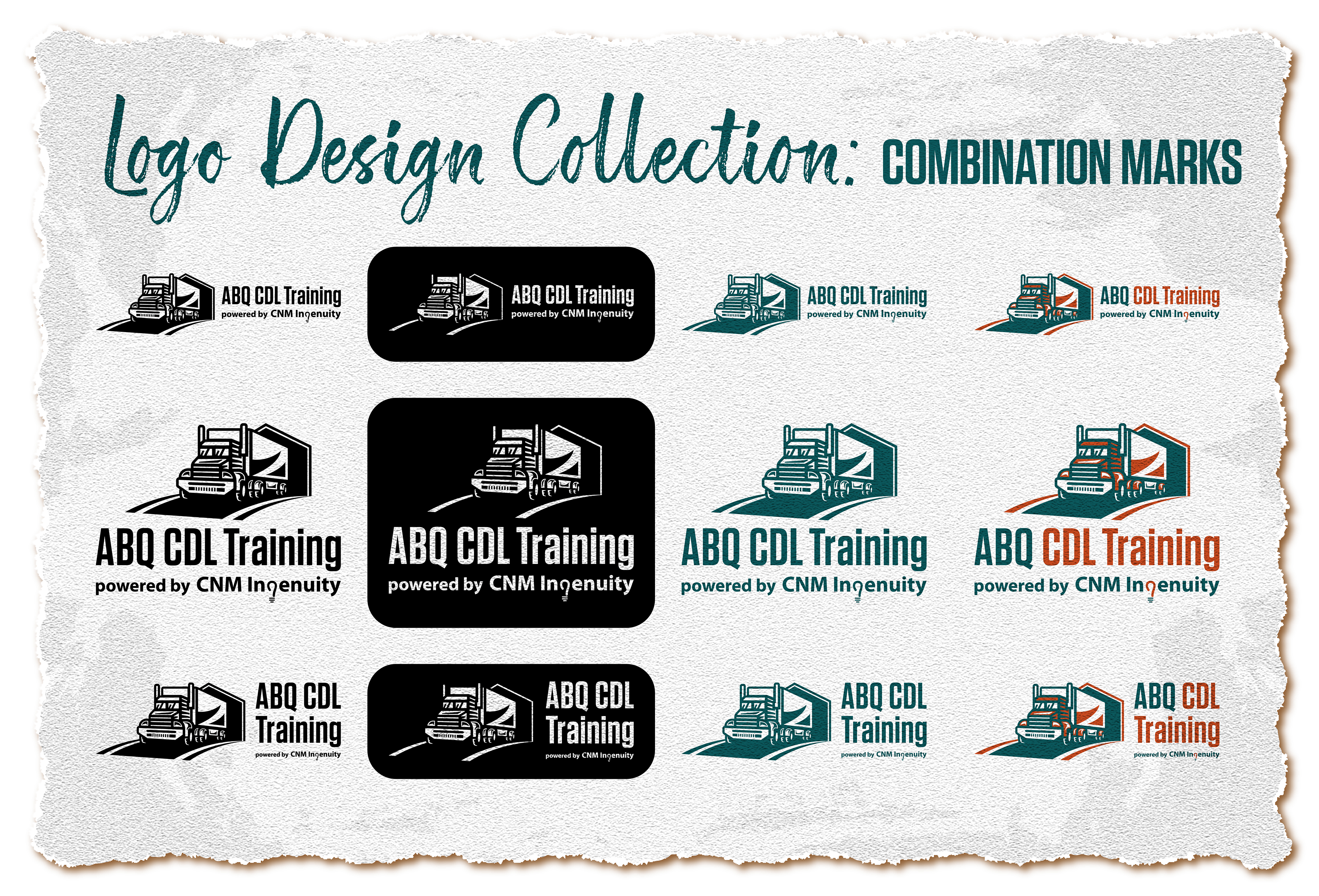
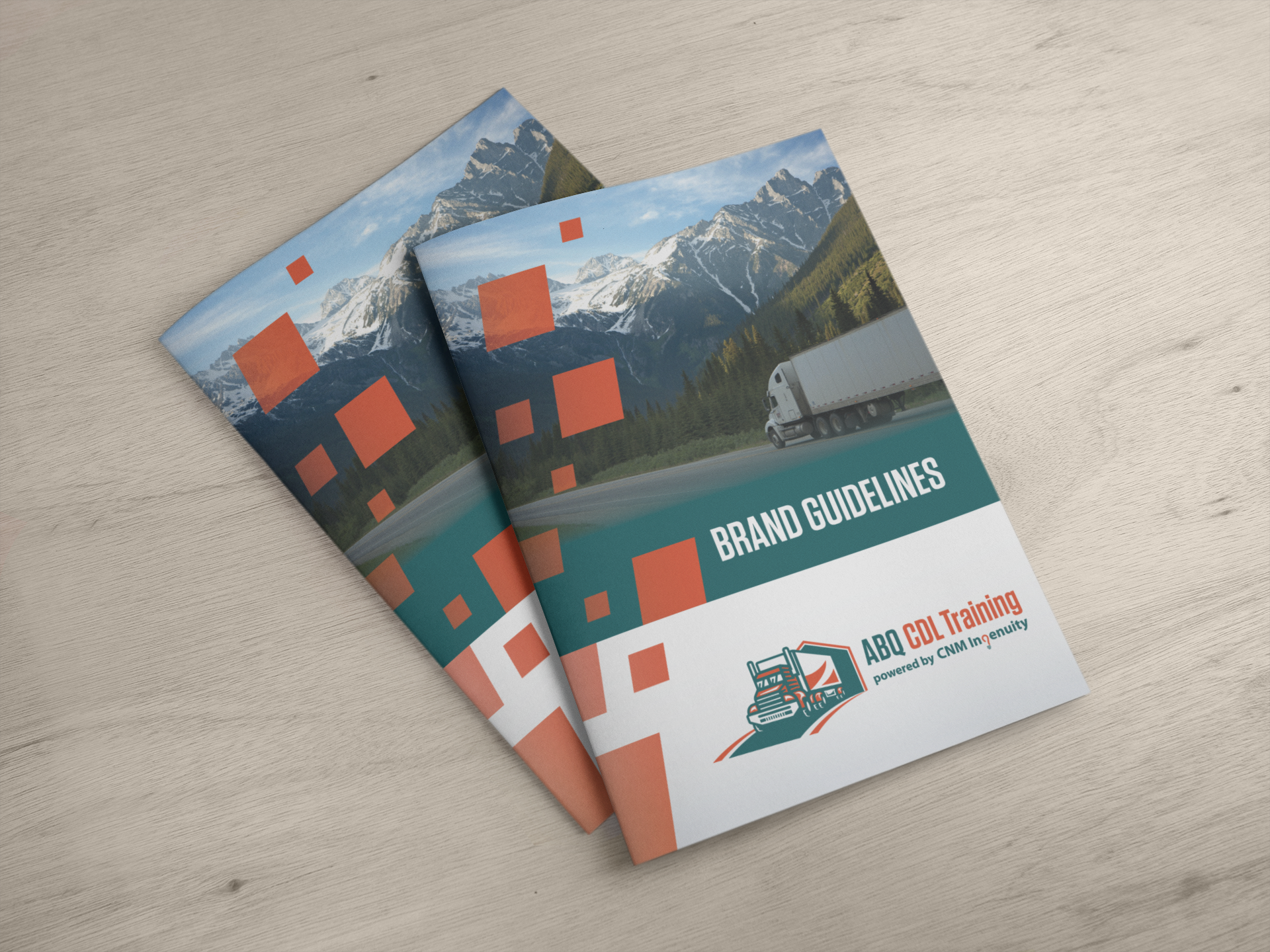
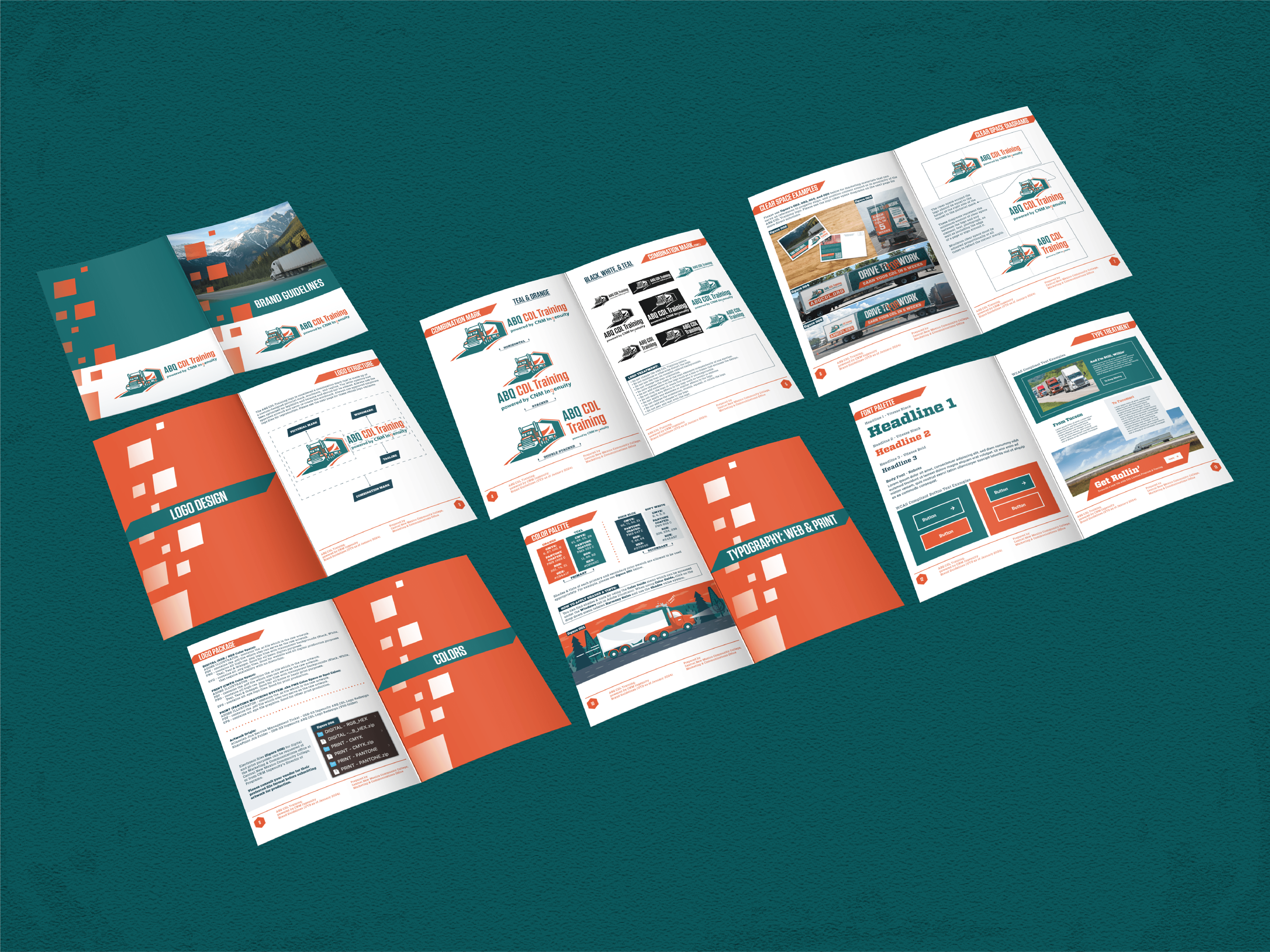
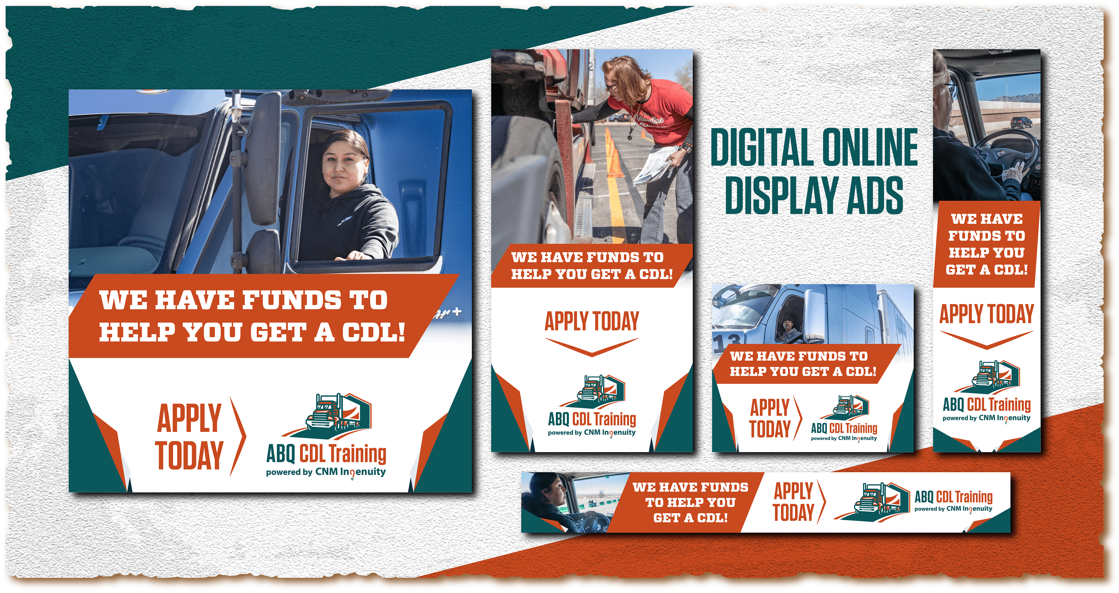
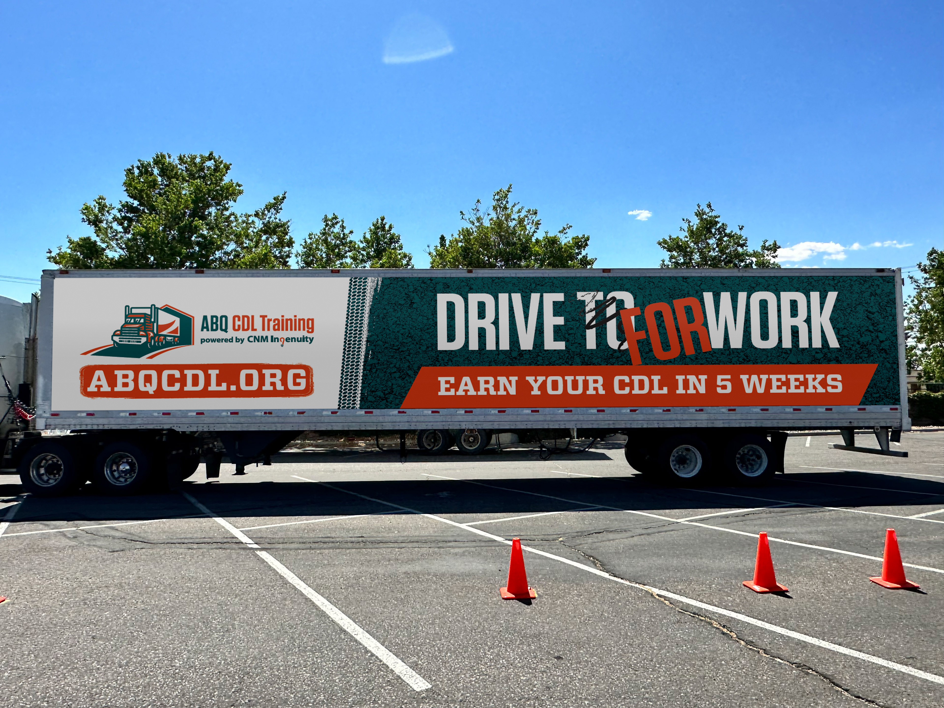
Our process for ABQ CDL Training began with a 5C's analysis that explored the brand's essence and it's connection to learners and the workforce. We delved into the heart of what makes ABQ CDL Training special - flexible scheduling, experienced instructors, funding resource options, and quality instruction. Drawing inspiration from other CNM Ingenuity sub-brands, regional competition, and nationwide truck companies, we developed a bold and driven comprehensive brand strategy that included industry driven logo concepts, a bright earth-tone color palette, and graphic style shape treatments that create the cohesive look and feel with advertisement and branding.
Process & Inspiration
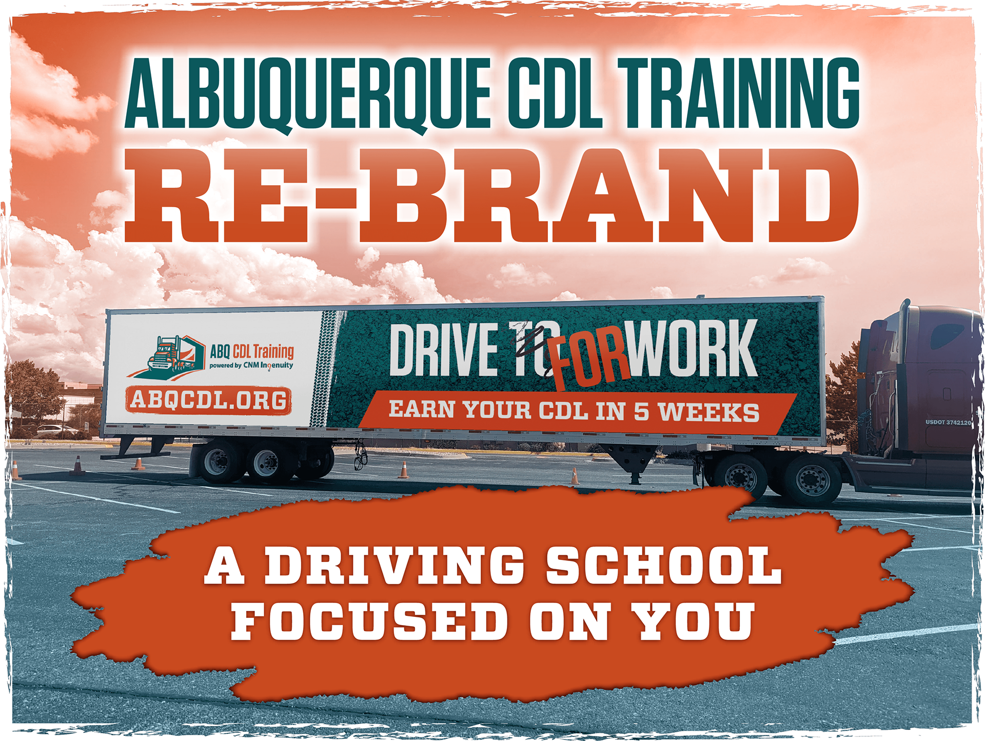
The creative brief from ABQ CDL Training was centered around crafting a brand that engages New Mexicans with a quality driven, affordable truck driving school with flexible scheduling that gets students trained faster, and on the road to a lucrative career. The client, CNM Ingenuity and ABQ CDL Training leadership, envisioned increased brand awareness that boosted application interest from local New Mexicans, increased funding opportunities, and engagement of workforce training partners. My design approach aimed to capture this vision through a visual identity system consisting of an industry driven logo, and evergreen graphic styles for advertisement. ABQ CDL Training needed a facelift to standout in a professional, and recognizable new way while still delivering on their strengths of affordability, flexibility, community support, immersive training, relatable outcomes, and experience.


Conclusion
MCO and I embarked on restructuring the ABQ CDL Training brand into something more professional and polished in appeal. The problem was that ABQ CDL Training lacked brand recognition despite their great reputation for quality, flexible schedules, experienced instruction, and funding resources. This negatively effected their recruitment for instructors, and student application interest because they lacked both marketing and advertisement structures that could endure. Our solution was to create a new brand identity for ABQ CDL Training that suited a modern audience between the ages of 21 to 30 & 31 to 55, appealing to both male and female populations. We broke away from masculine themes that tend to be seen amongst other truck driving school and companies, with a warm, colorful, and more inviting visual direction I designed. Ever since the brand restructure, ABQ CDL Training has seen the application numbers increase with a more diverse student community. There has also been an increase amongst instructors that has helped with scheduling more classes and on the road training.