
Objective
Deep Dive Coding Bootcamps (Deep Dive) is powered by CNM Ingenuity. CNM Ingenuity is a nonprofit that helps Central New Mexico Community College (CNM) pursue cooperative ventures in technology, entrepreneurship, and provides skills training. Deep Dive reached out to the Marketing & Communications Office (MCO) at CNM, in need of a brand revamp. Our objective was to restructure Deep Dive Coding Bootcamps into a professional, career-focused, relatable, achievable, and regionally appealing brand. Our goal was to lift and lighten the visual appeal so that it can resonate with every student no matter how they identify as.
Project Scope
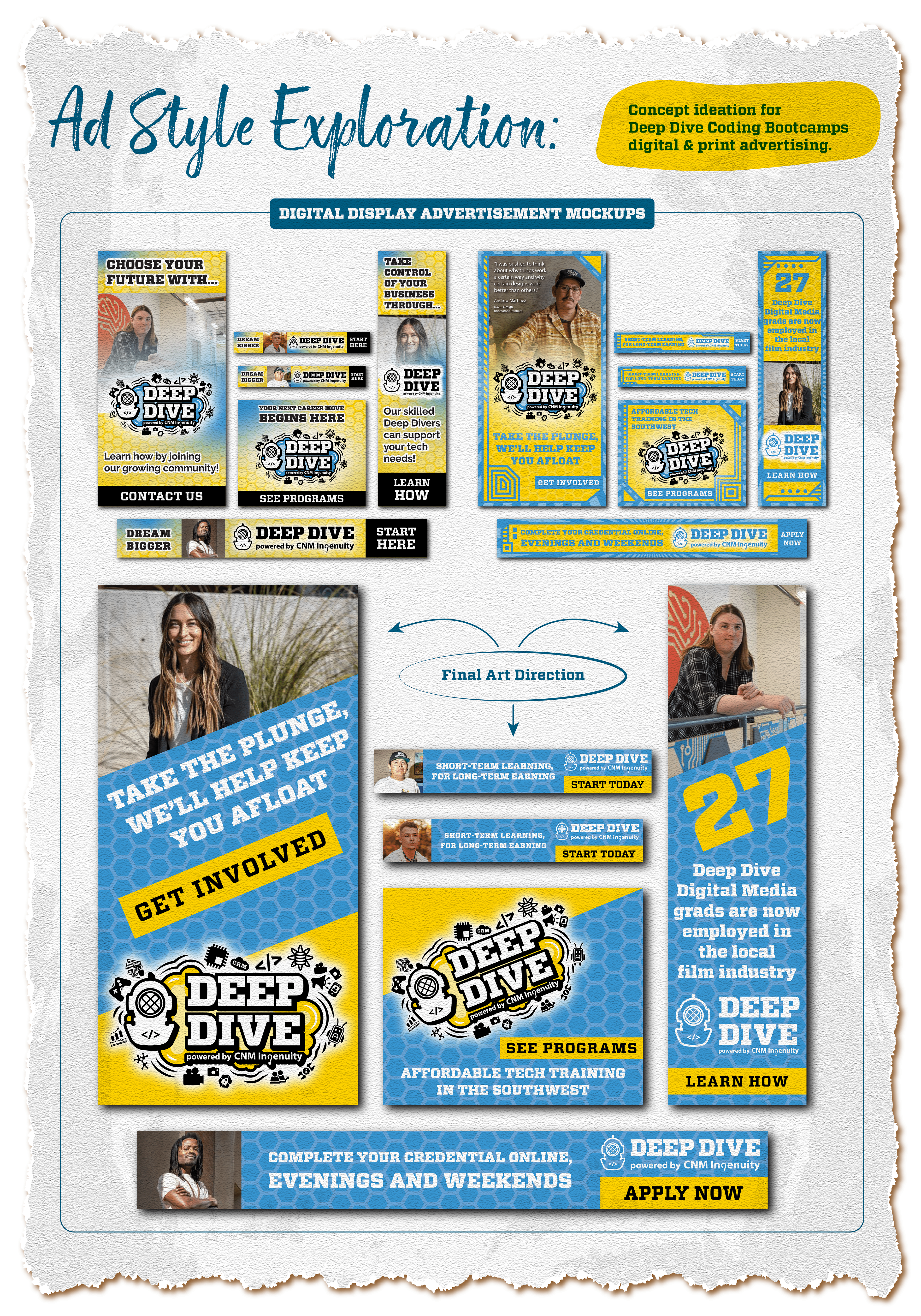
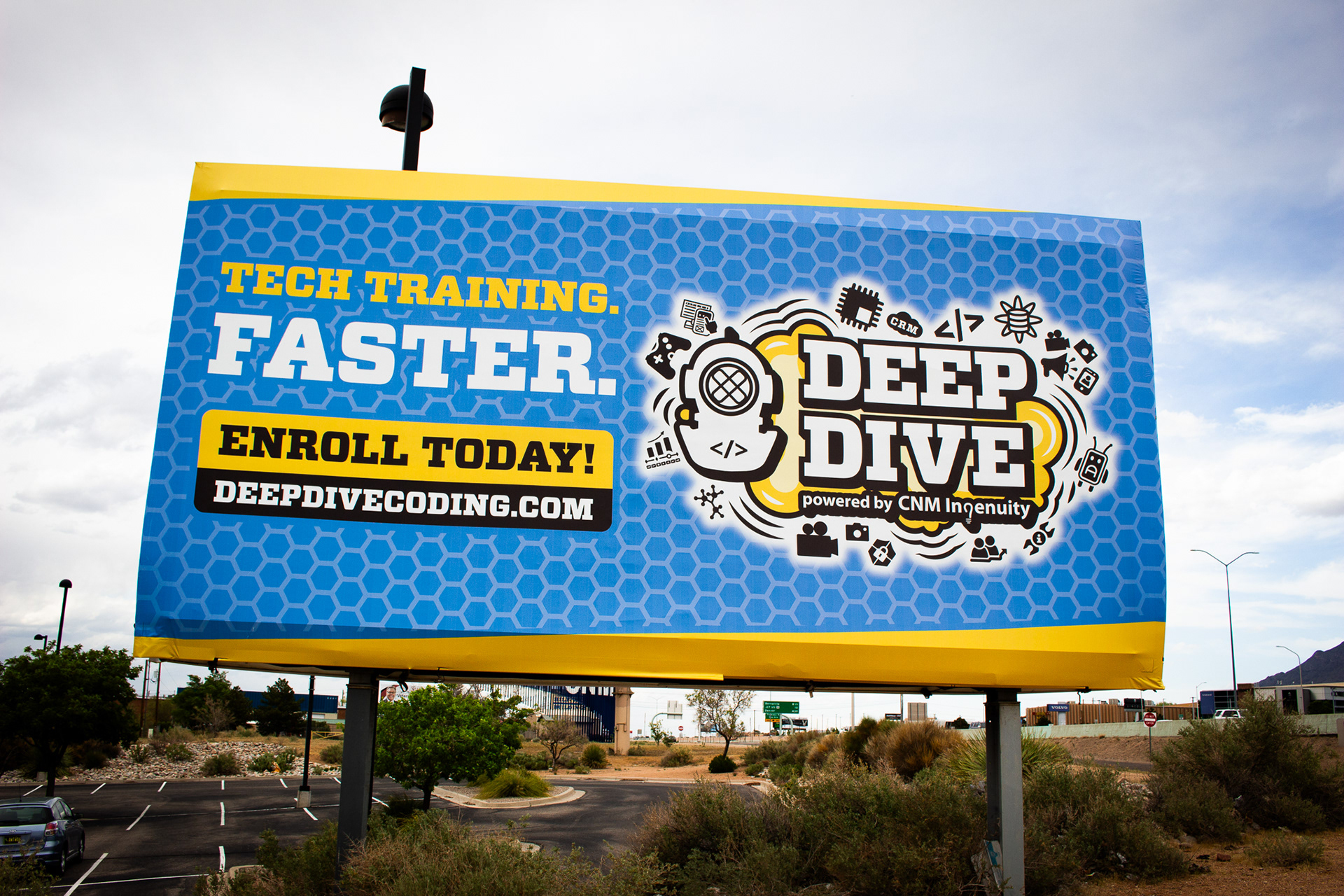
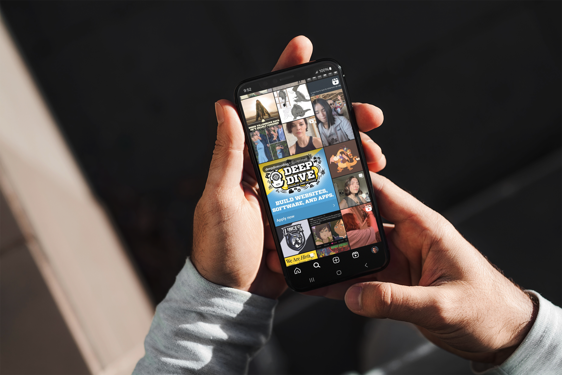
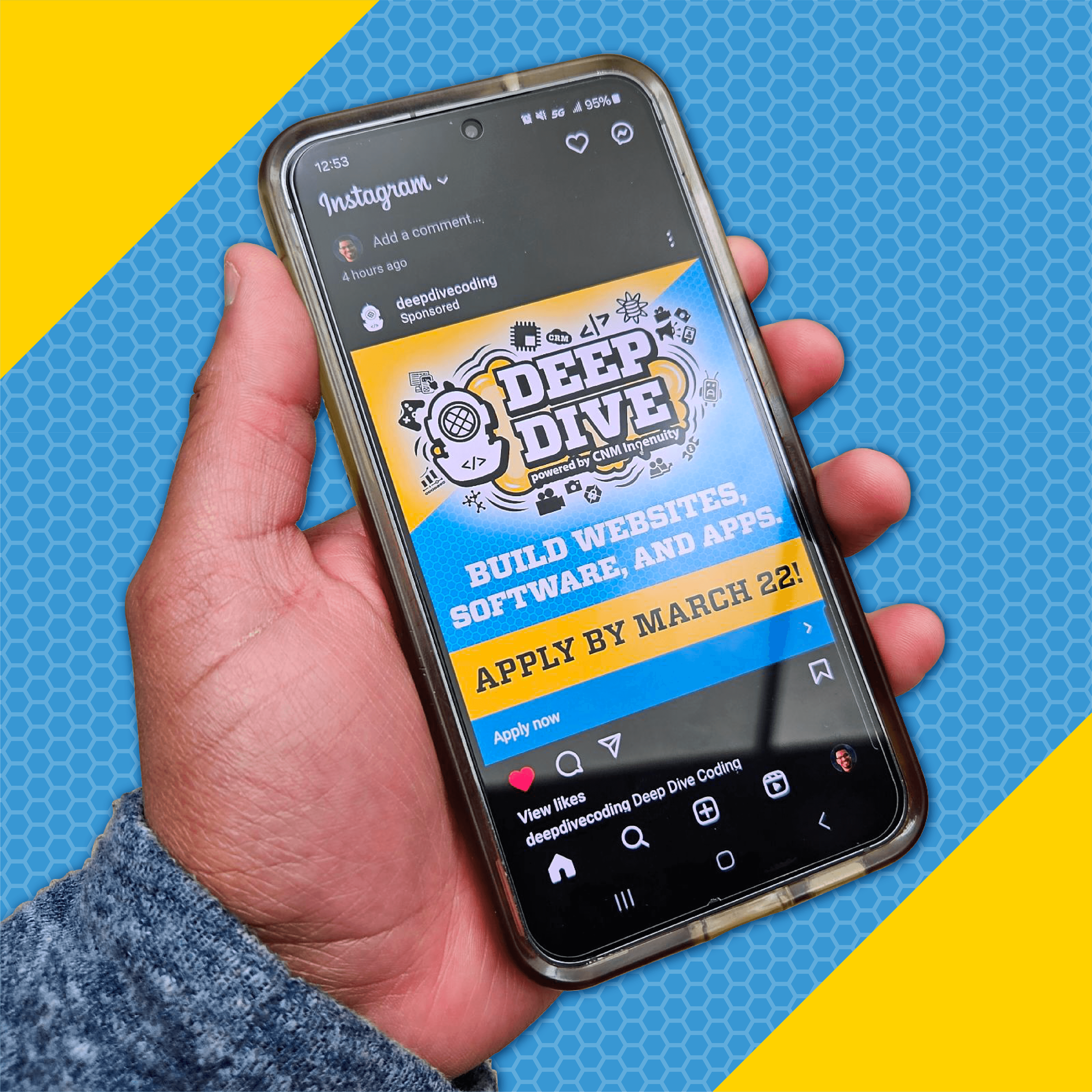
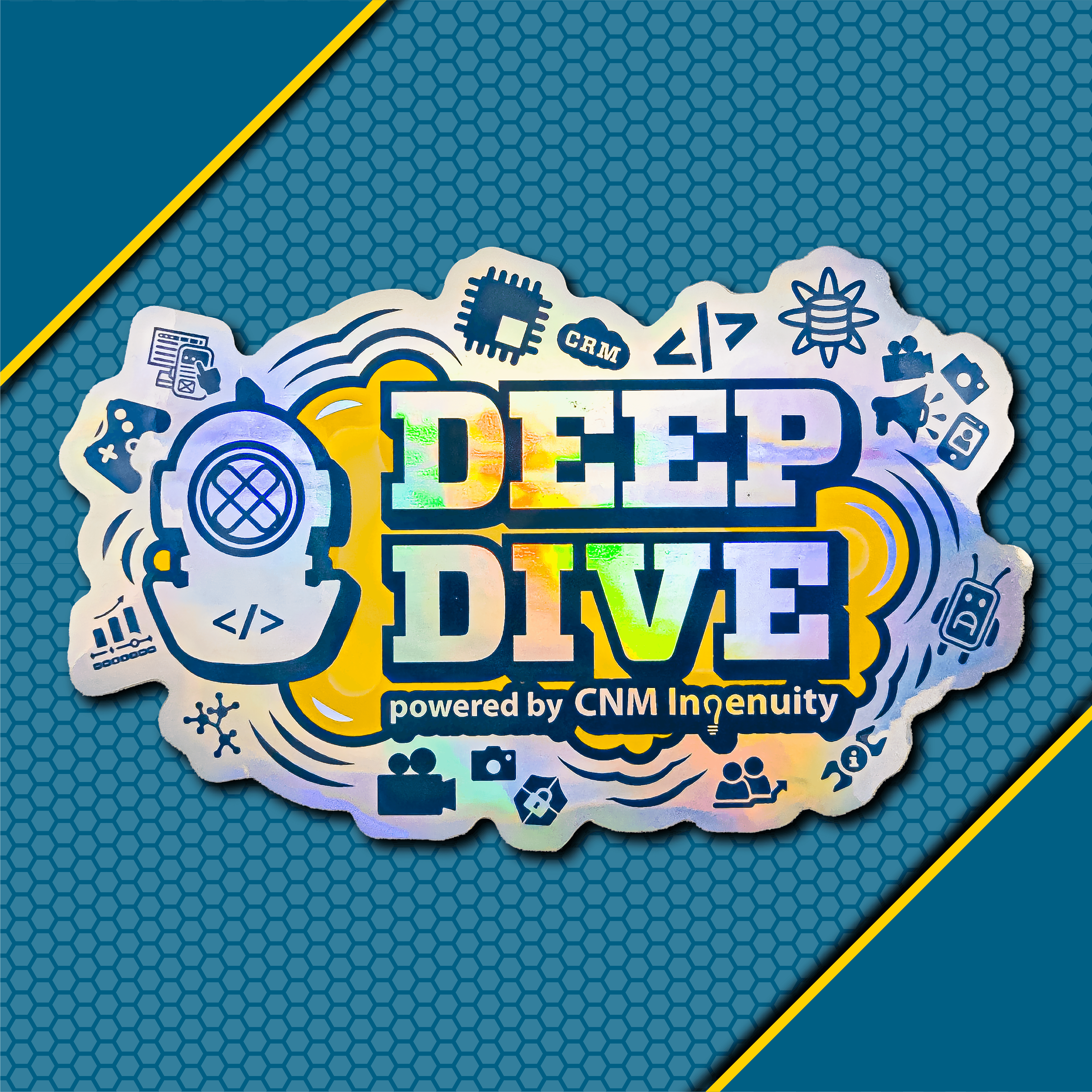
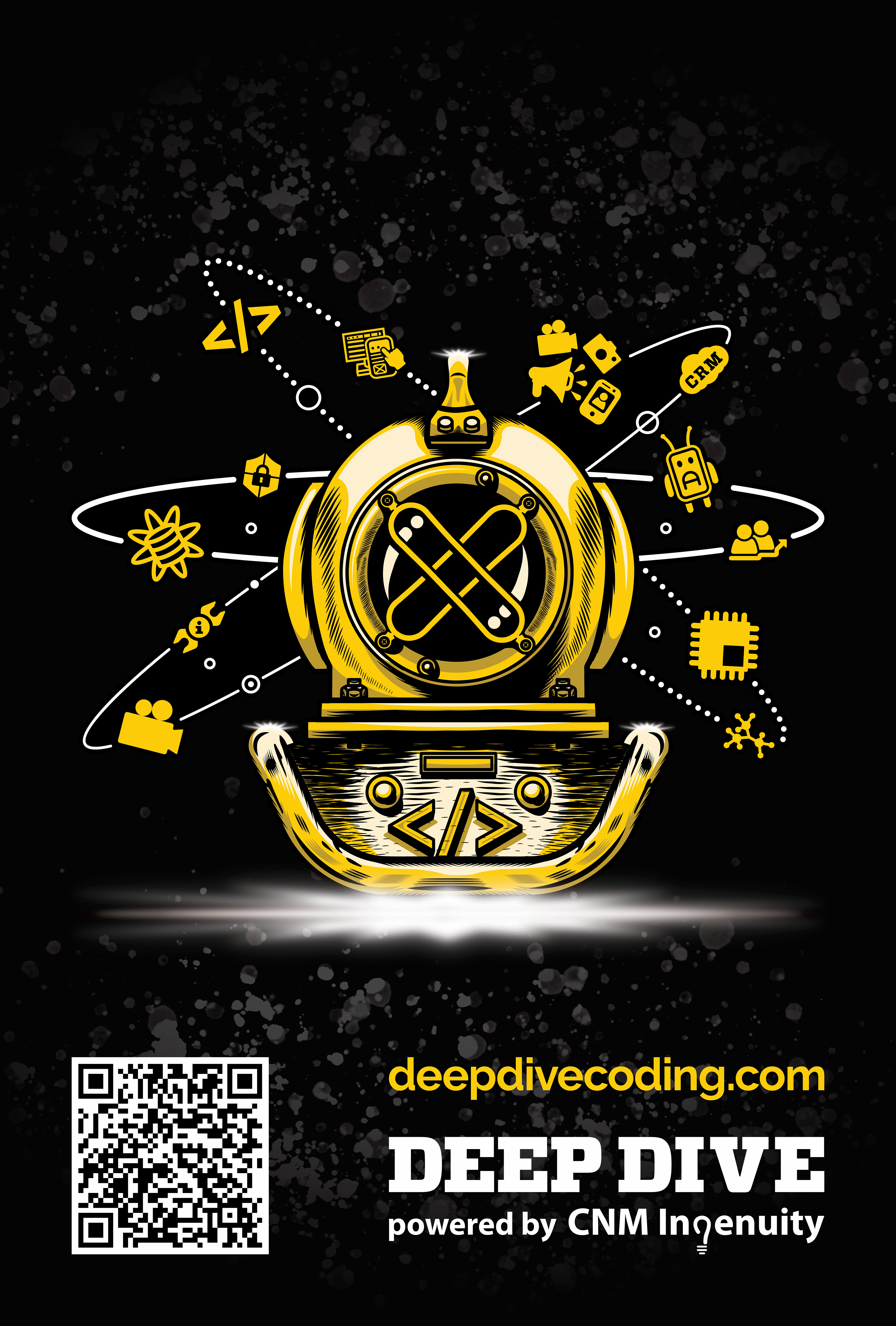
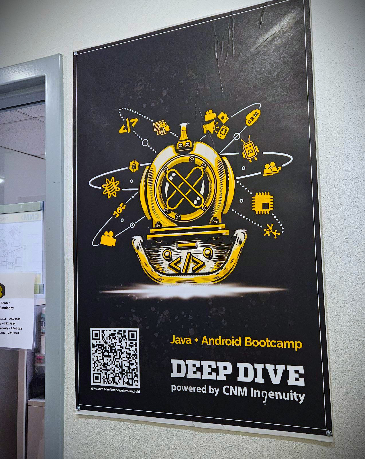
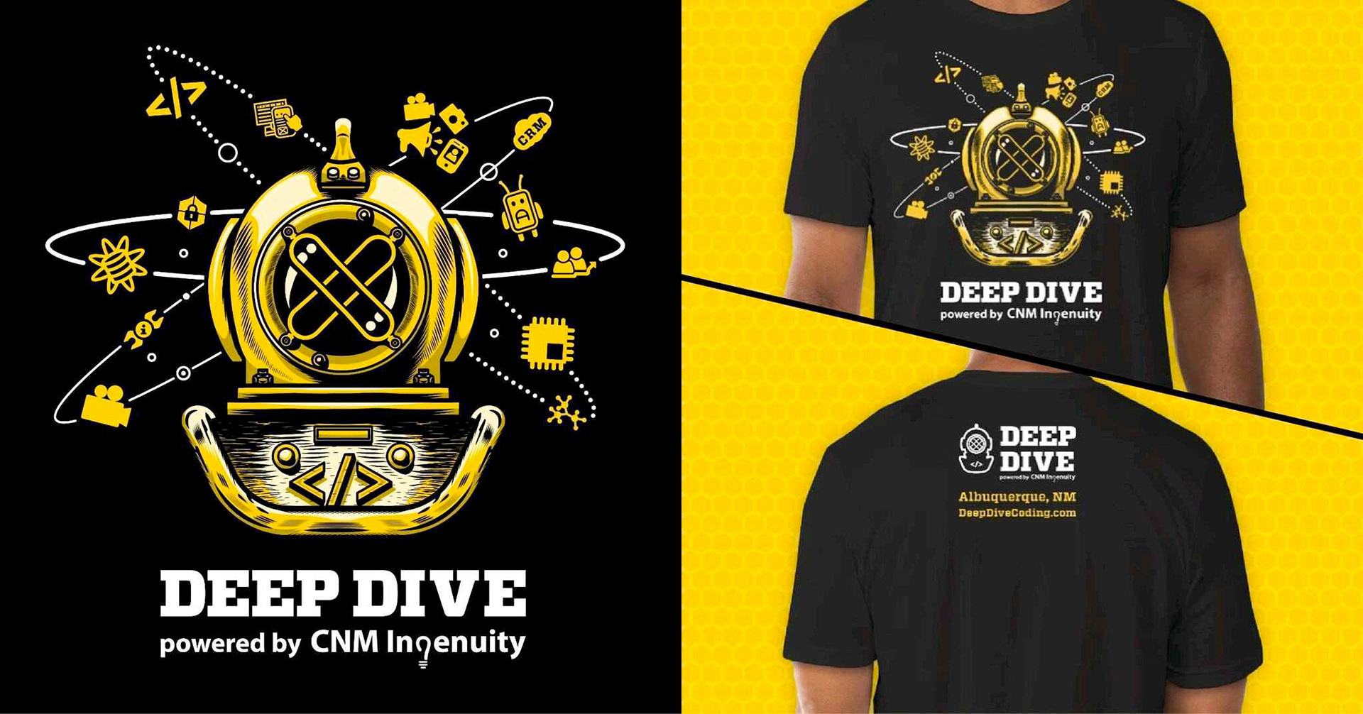
Our process for Deep Dive began with an exploration of the brand's essence and it's connection to learners and the workforce . We delved into the heart of what makes Deep Dive special - comprehensive programming, flexible scheduling, online learning, affordability, reliability, and network connections with industry leaders. Drawing inspiration from current CNM Recruitment & Outreach marketing materials, prior outsourced marketing strategies, and streaming channel artwork, we developed a tech driven comprehensive brand strategy that included decorative graphic style treatments, energized logo concepts, bright complimentary colors, and engaging tech style graphics. Each element was carefully crafted to reflect the brand's commitment to tech training with faster solutions.
Process & Inspiration
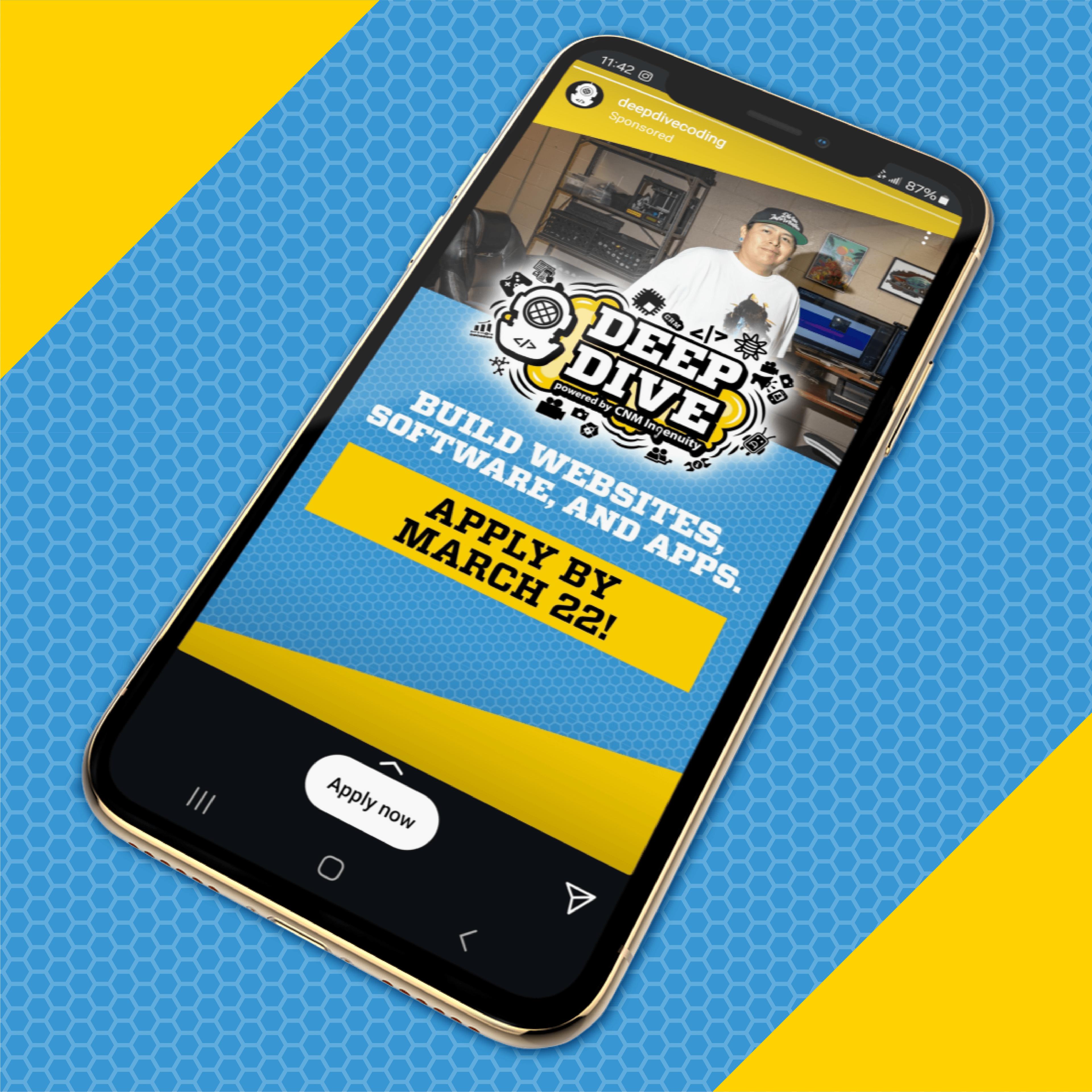
The creative brief from Deep Dive was centered around crafting a brand that engaged New Mexicans in a more approachable way. The client, CNM Ingenuity and Deep Dive leadership, envisioned increased brand awareness that boosted application interest from local New Mexicans, increased funding opportunities, and engagement of workforce training partners. My design approach aimed to capture this vision through tech driven graphic styles, brighter color schemes, geometric shapes, and energized interior elements. Deep Dive needed to standout in a brighter and energetic new way while still delivering on affordability, immersive training, with relatable outcomes.

Conclusion
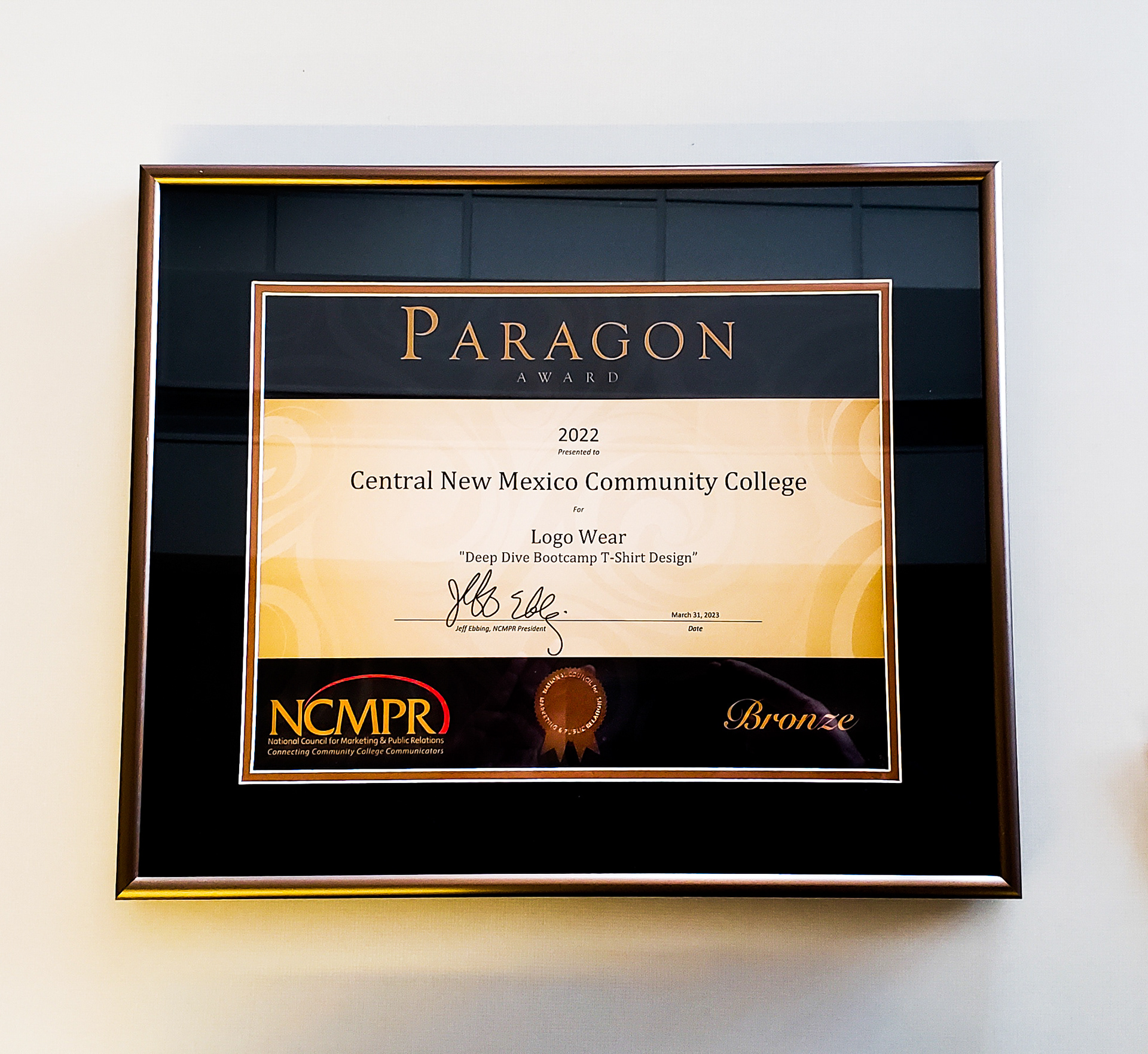
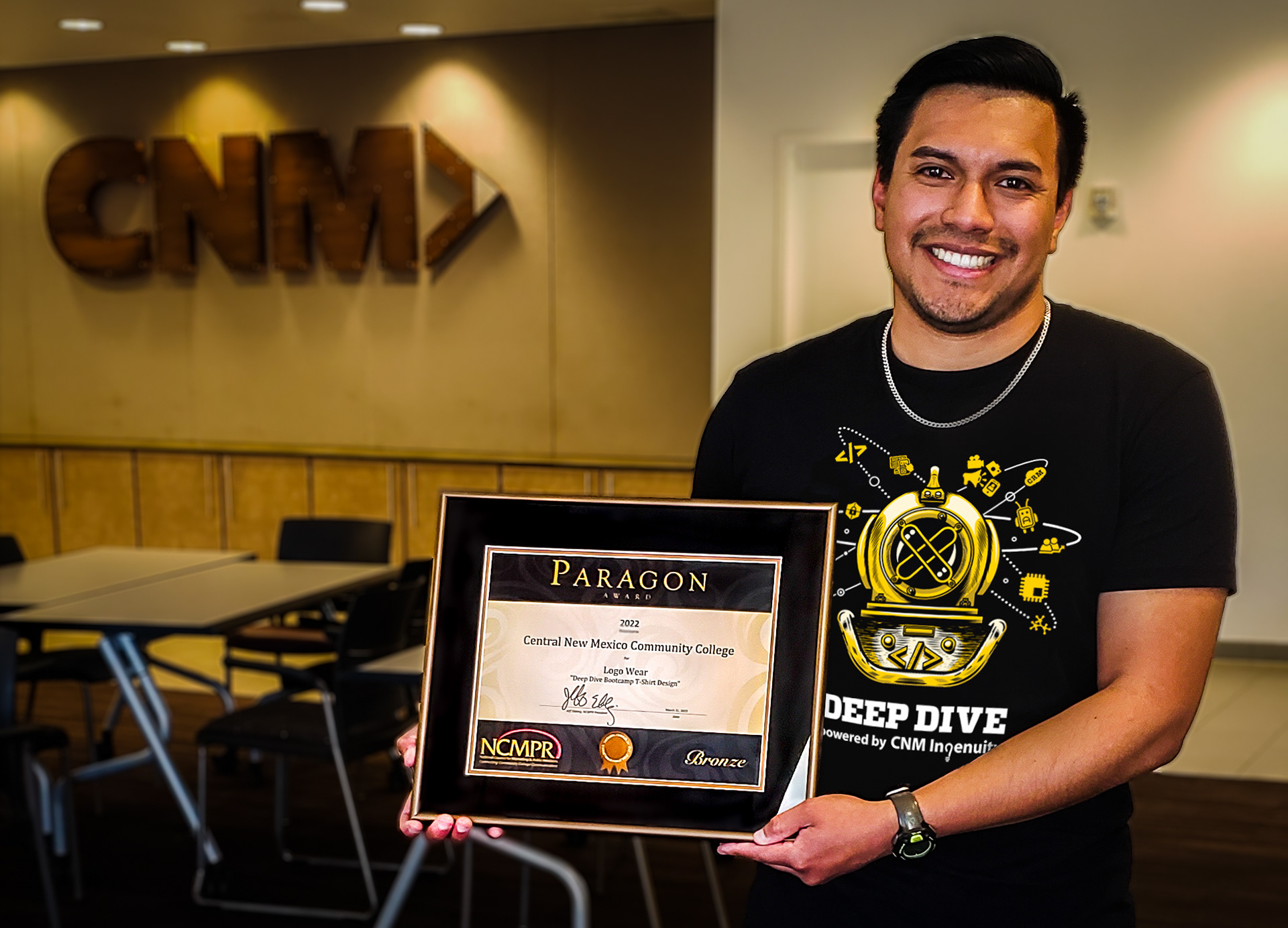
MCO and I embarked on revamping the Deep Dive brand into something more uplifting in feel and appeal. The problem was that COVID-19 caused Deep Dive to have to shift classes to being primarily online in an effort to meet learner needs so that their profit margin could stay afloat. They also were more masculine in appearance which didn't create equal room for allowing female students and other minority groups to apply. Our solution was to create a new identity for Deep Dive that suited a modern audience and appealed towards anyone interest in taking on tech. We broke away from the masculine themes with a new visual direction I designed that polished off the new look and feel. Ever since the brand restructure, Deep Dive has seen the application numbers increase across all programs which has fostered more diverse student interest in technology and feelings of achievable career or life change.