January 27, 2020 - My buddy Austin asked me if I could provide design services for his family's restaurant and market located in South Portland, Maine. Austin and I met in college, and we became friends through work in the Pierce Media Group Organization. I had freelanced for Austin and his family once before back in 2017. This was before they owned their current business, and when they had been thinking of starting a general store. He currently is in charge of the marketing & advertising of the family restaurant, and he reached out to me because they were in the middle of rebranding and they needed a new logo design. I said to him just provide me a creative brief document which entails all current brand documentation, budget information, design ideas, time frame for project completion, values to be represented in the logo. After I have conducted my thorough review of the brief, asked any further questions, and planned out the work schedule, then I could provide him a quote.
BUSINESS SYNOPSIS
Come tie up with us! Have fresh Maine seafood served by Maine people. Docks Seafood is a local favorite in the Greater Portland area. Docks is known for its raw and authentic Maine vibe and nautical design. We want to promote a brand that prides itself on its Maine roots, fresh food, and community. Our mission is to bring fresh local seafood to our customer, no matter the season. The Maine Market at Docks is supplied with live lobster, fresh haddock, scallops, shrimp and more! We don’t just stop at seafood, we even have Maine made crafts, snacks and art from locals.
CREATIVE BRIEF REVIEW
Breaking down the creative brief required reading and re-reading the document in order to understand what ideas I need to focus on. When I read a creative brief, I usually highlight key words, color & font specifications, imagery, terms, phrases, budget, timeframes, etc. All of these variables encompass the creative direction I was to take in developing concept ideas.
CREATIVE BRIEF BREAKDOWN
• Design Style = Nautical
• Brand Embodiment = Maine roots, fresh food, and community
• Business Names = Docks Seafood, Docks Seafood, Docks
• Colors = Red #AD1822 & introduce a darker blue
• Mood = Welcoming
• Imagery = Lighthouses, lobster, wood texture, rugged coastlines, fish
• Budget *undisclosed to the public
• Time frame = Proofs by March 1st *Dates changed based on creative
• Usage = Website, t-shirts, signage, menus, print collateral, etc.
Creative Brief
CREATIVE PROCESS
After quoting a price and discussing my terms of service, we finally started the creative process. There would be three phases within the process: Development, Design, and Delivery. Each phase had individual steps that needed to be completed in order to proceed into the next phase.
PHASE 1 - DEVELOPMENT
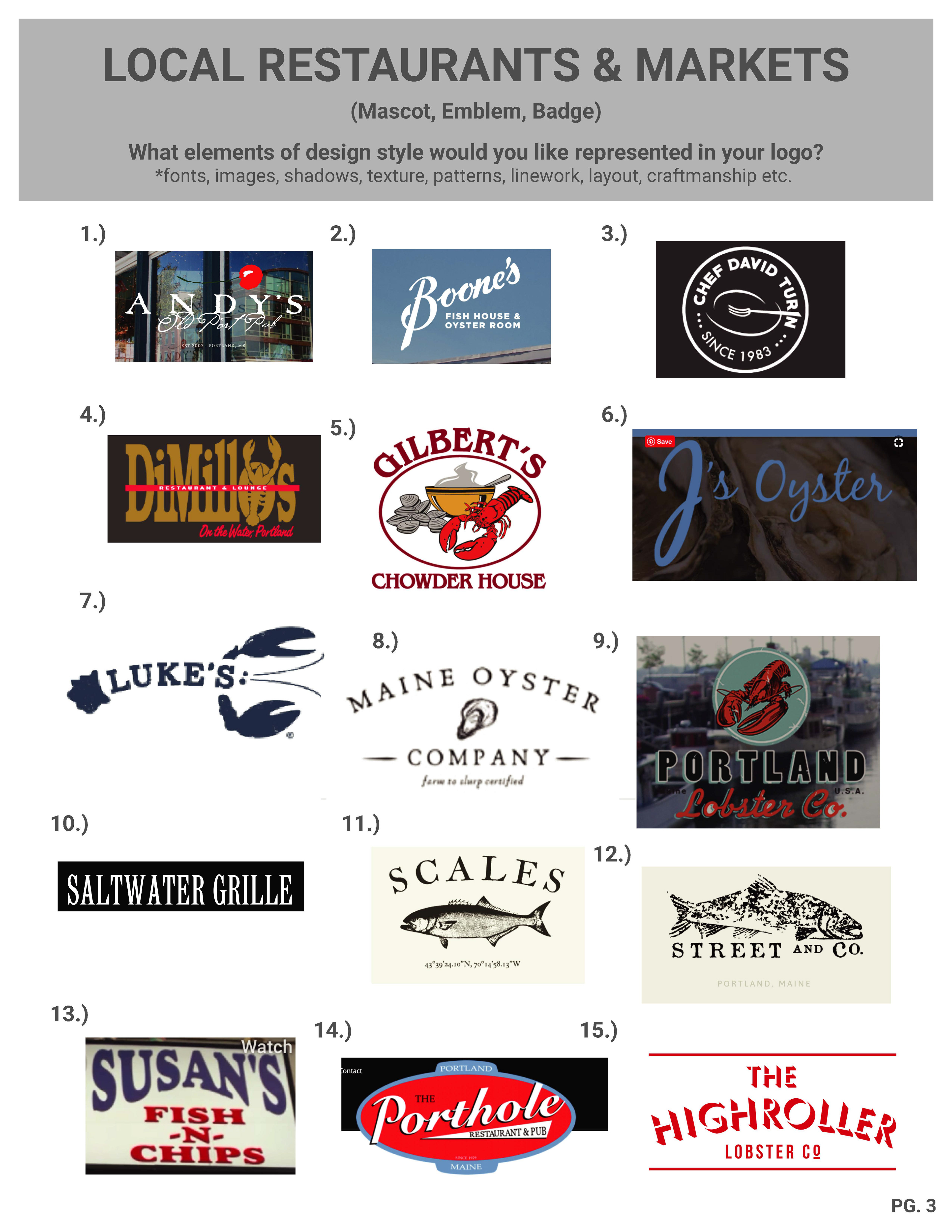
I researched into Dock's location, local competition, similar business types, and then created a mood boards for review. Creating the mood boards provided examples of logos that fit the categories of modern, and vintage. These mood boards gave Austin and his family a clear look at the sea food restaurant and market community they find themselves in.
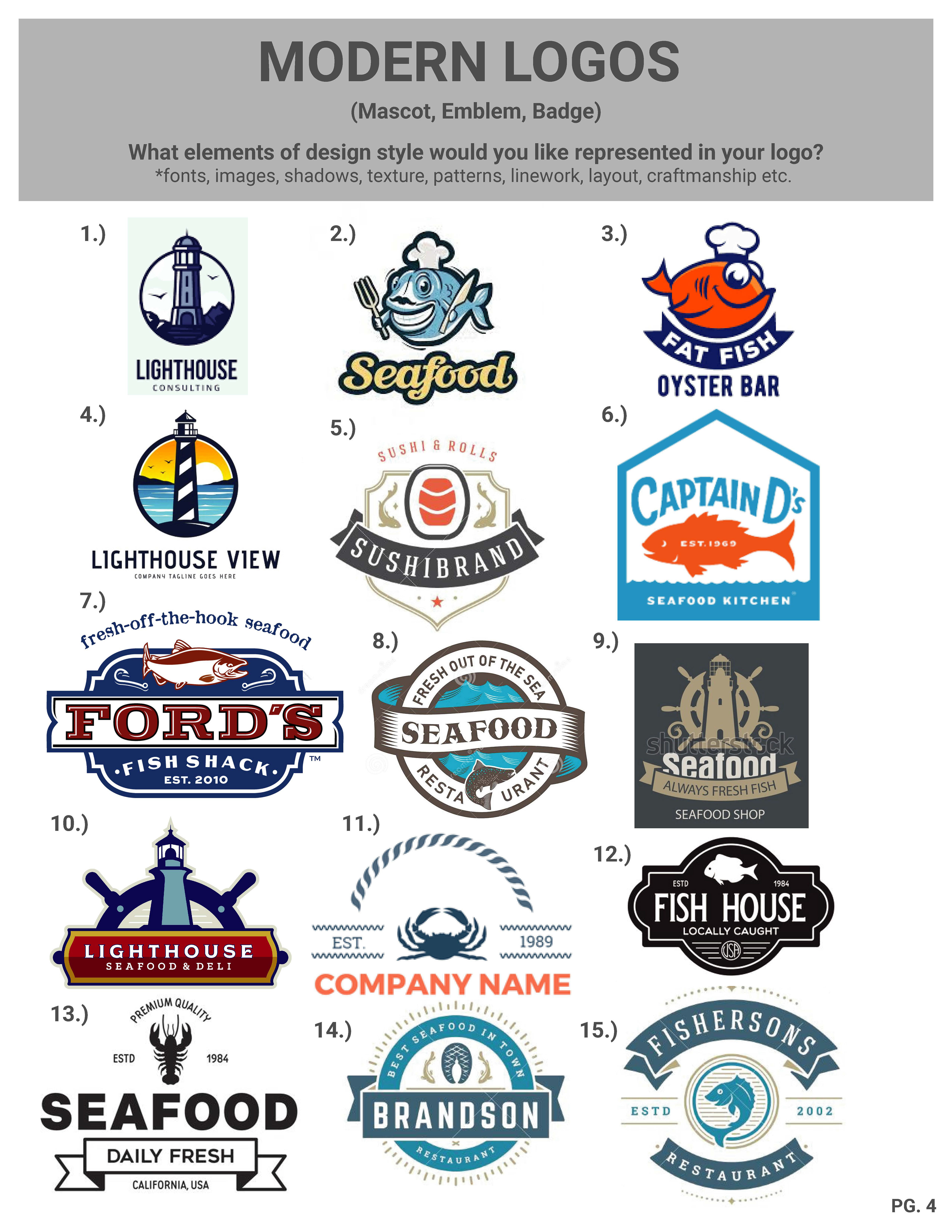
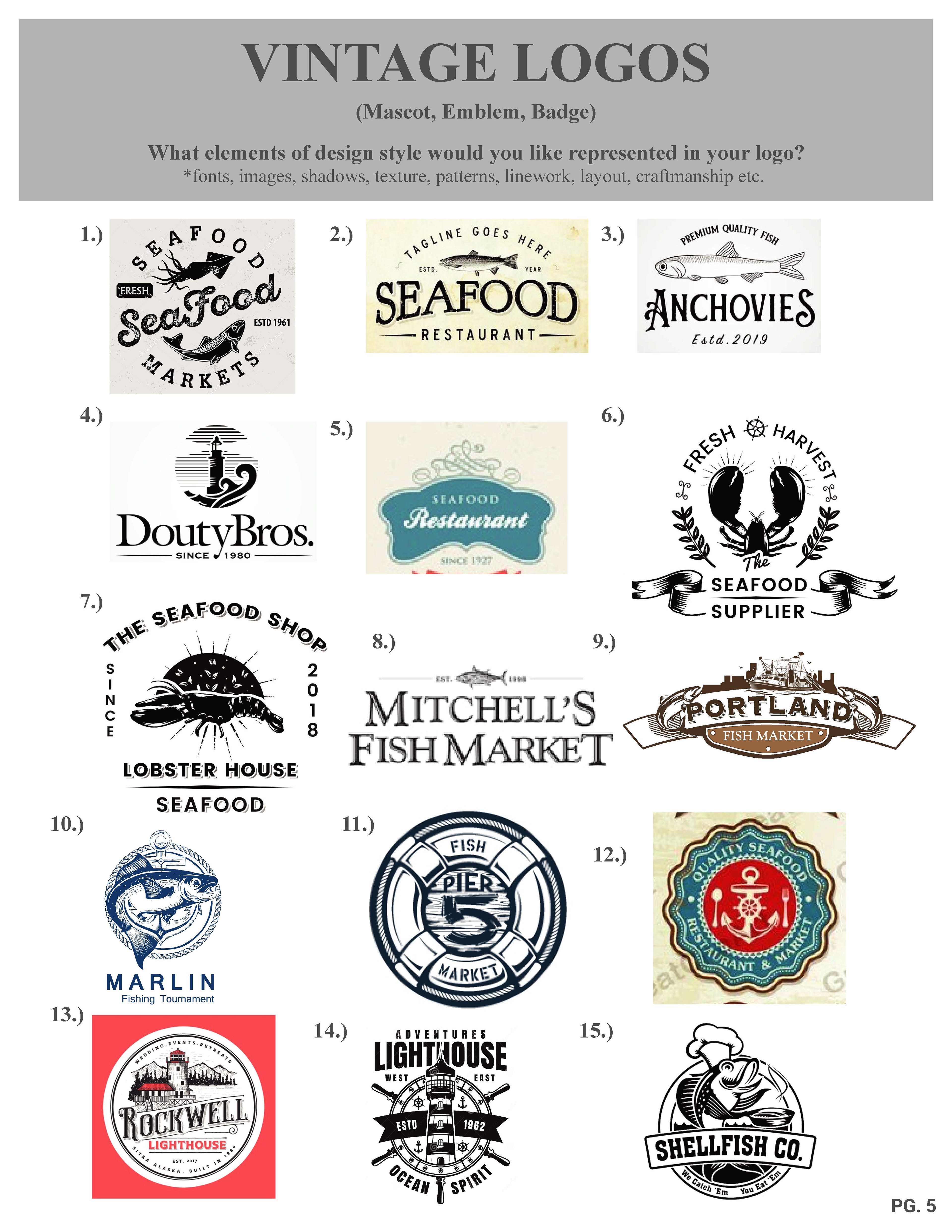
On a design level they were inspired to base their logo off of one of the Modern Logos, specifically number 10. Creating the Portland headlight and positioning it in the background of the logo would be important since it's a signature landmark within the community and people use it as an identity. The vision was to keep the same font in their old logo which was Copperplate Bold because it honors the past. DOCKS SEAFOOD would act as the display name with "SEAFOOD" placed inside of a banner underneath "DOCKS," while RESTAURANT AND MARKET would sit underneath. Throughout the year, lobster boats can be found bobbing on the waters of Casco Bay. Maine is known for it's lobster and so of course there needed to be a lobster boat added into the foreground.
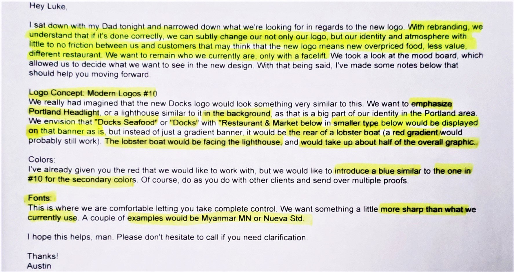
Mood Board Feedback
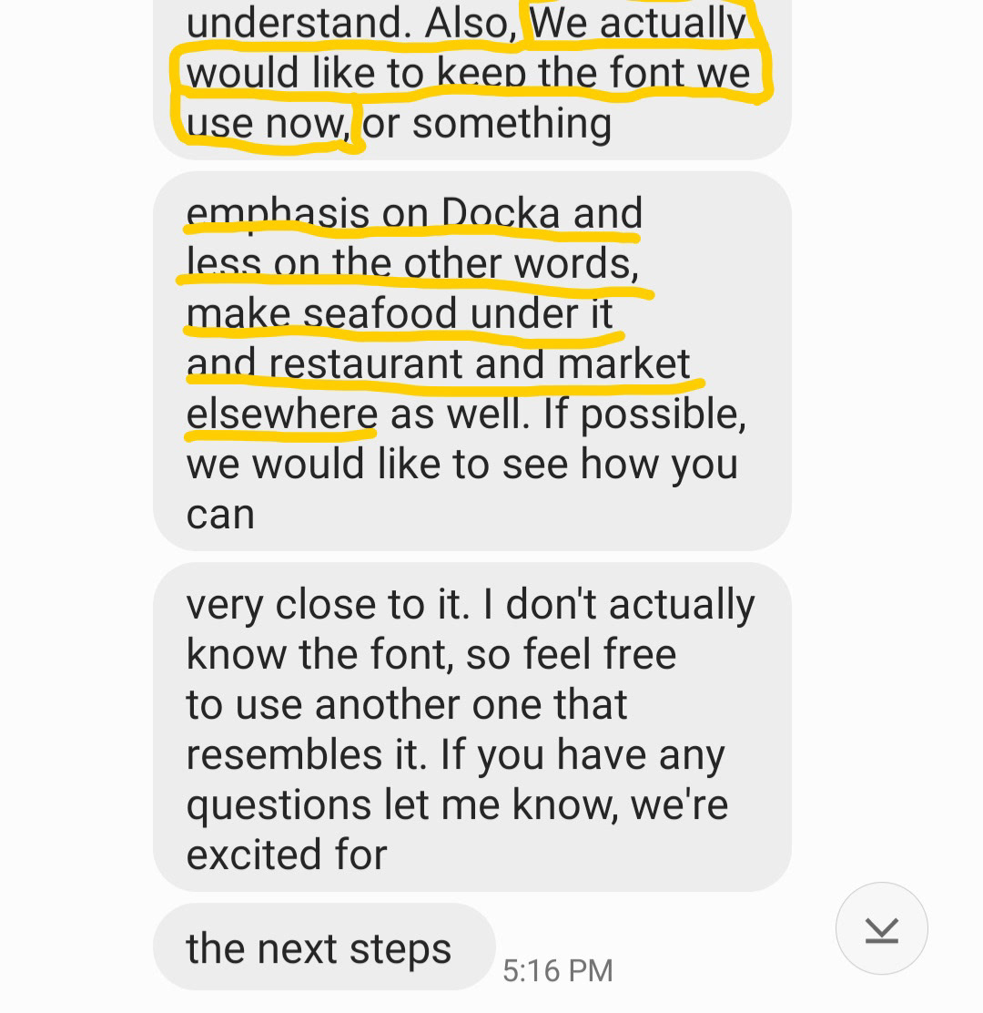
Font Selection
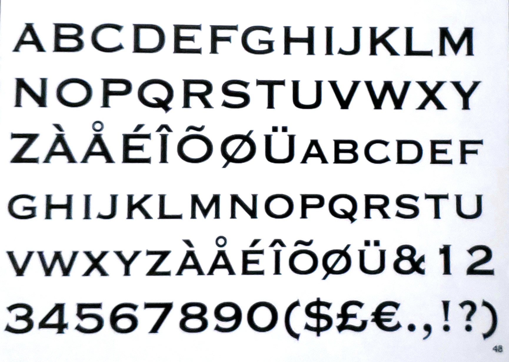
Copperplate Font
PHASE 2 - DESIGN
With all the ideas I had now to work from, I sketched and presented my drawings for review. Austin noted his findings in each drawing and what he liked the most was the design of the boat and the lighthouse you see here. I sketched up two more drawings and after Austin reviewing them he noted that he liked how I stacked the copy and illustrated an actual dock in the imagery as well. After receiving his feedback, I proceeded into creating four proofs for Austin and his family to review. They provided me feedback on the one they liked and requested me to make a few minor edits. When I completed the edits, I submitted the proof and at the end of the review, Austin and his family gave me their approval!
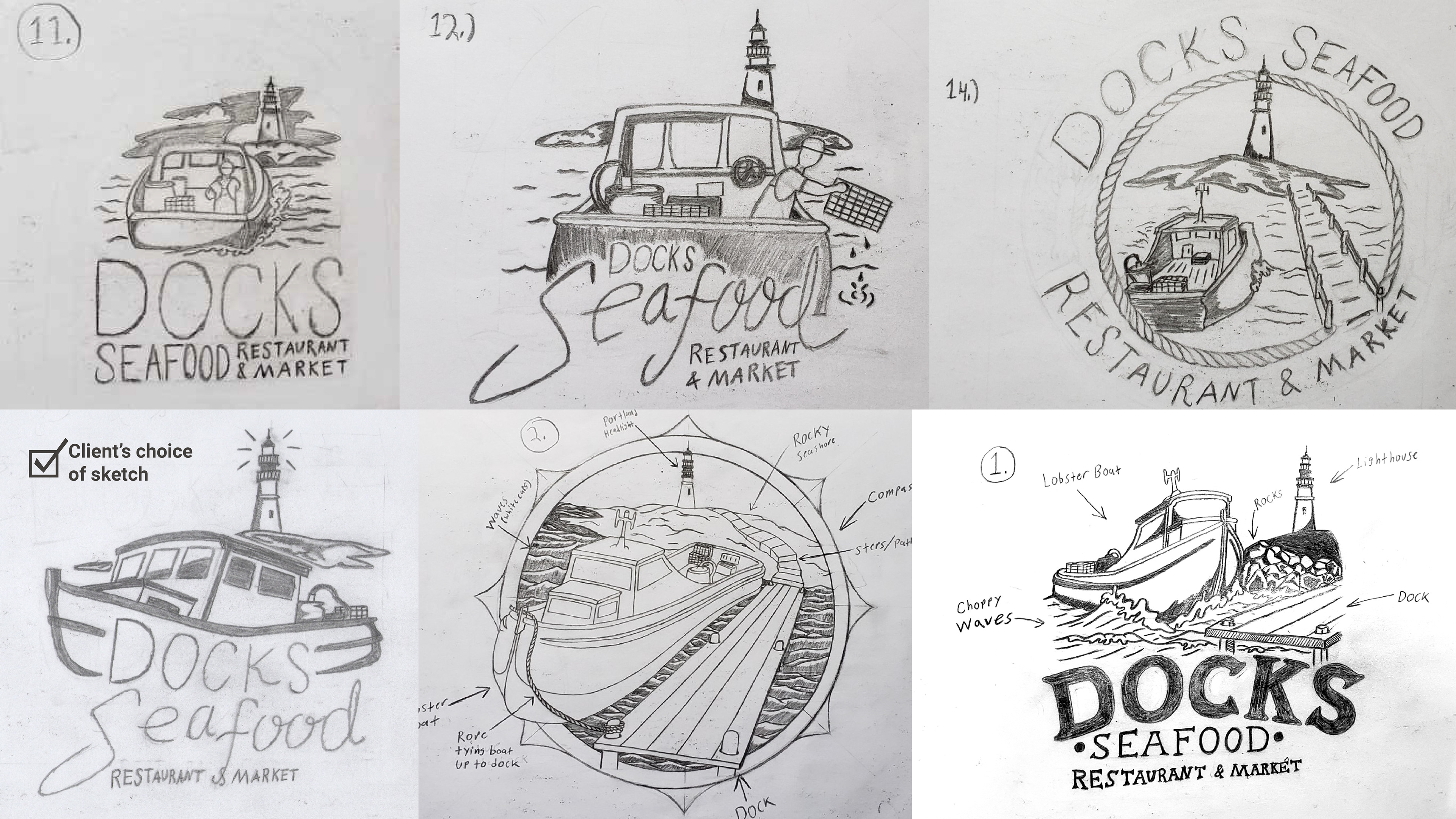
Sketch Proofs
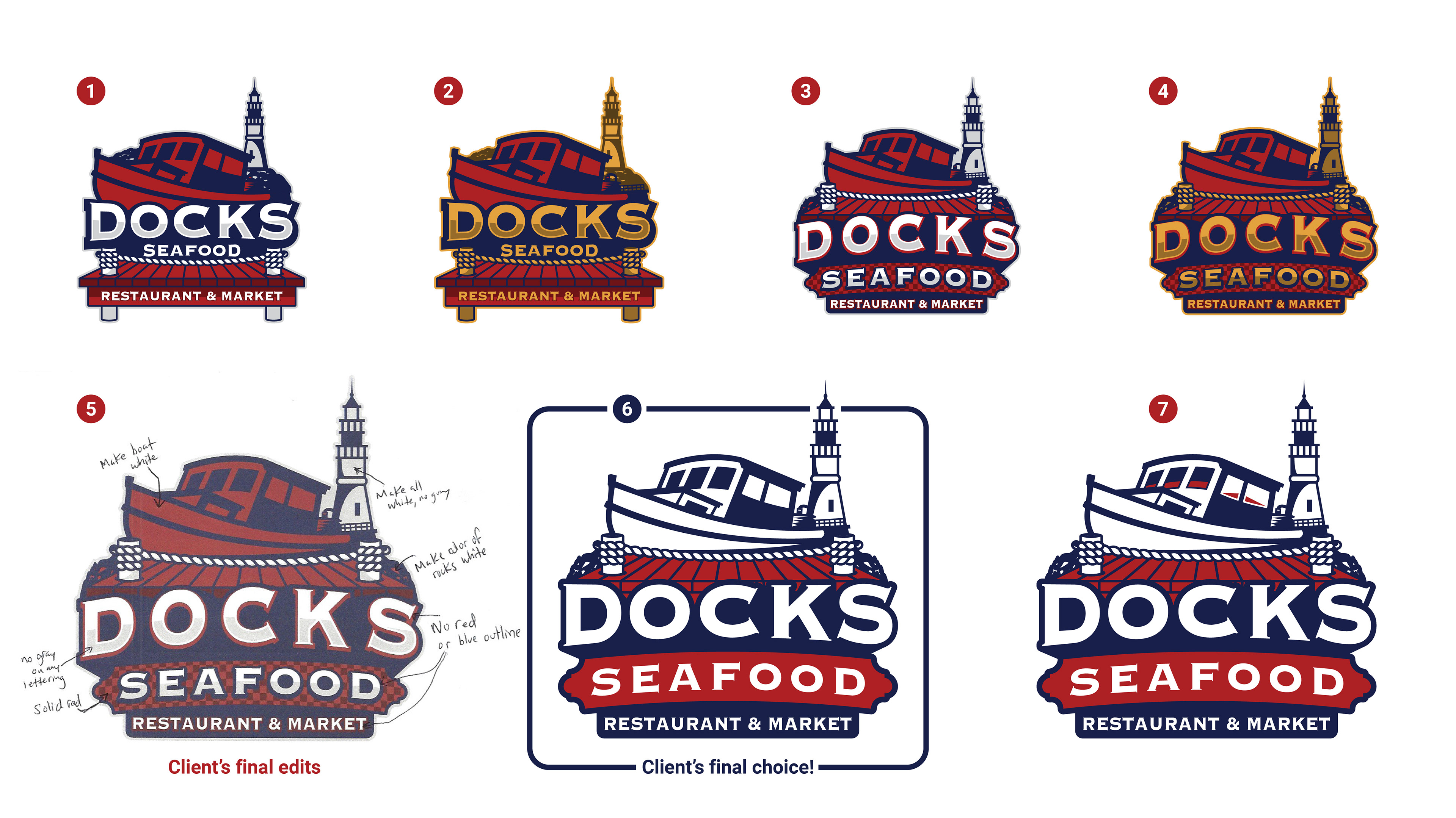
Vector Art Proofs
PHASE 3 - DELIVERY
Designing the logo was completed! It was time to then produce the proper digital and print file formats. I separated and trapped the the colors of logo and converted this master copy into proper print formatted files. Then I saved copies of those files and reformatted them for digital purposes. All the print and digital files were placed into print and digital folders for organization. I delivered the formatted and native files to Austin via Google Drive and when that was done I put together a visual identity guide for him that could be used for reference when creating marketing content.
SIGNAGE, MERCHANDISE, PROMOTIONAL ITEMS & MORE
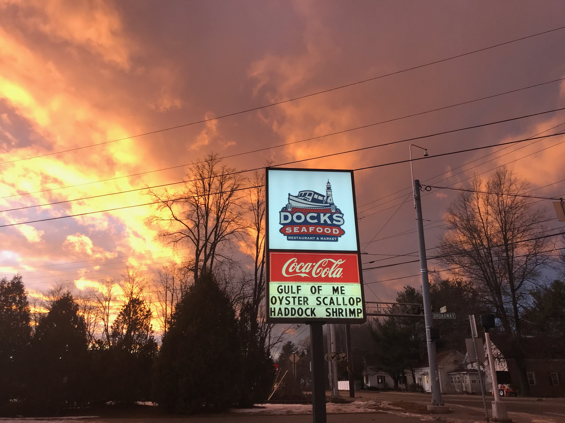
Outside Signage
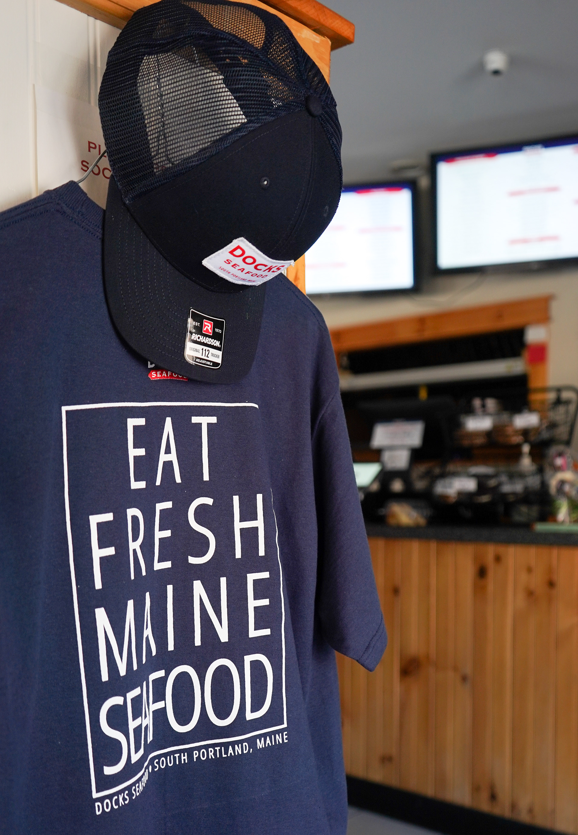
Merchandise
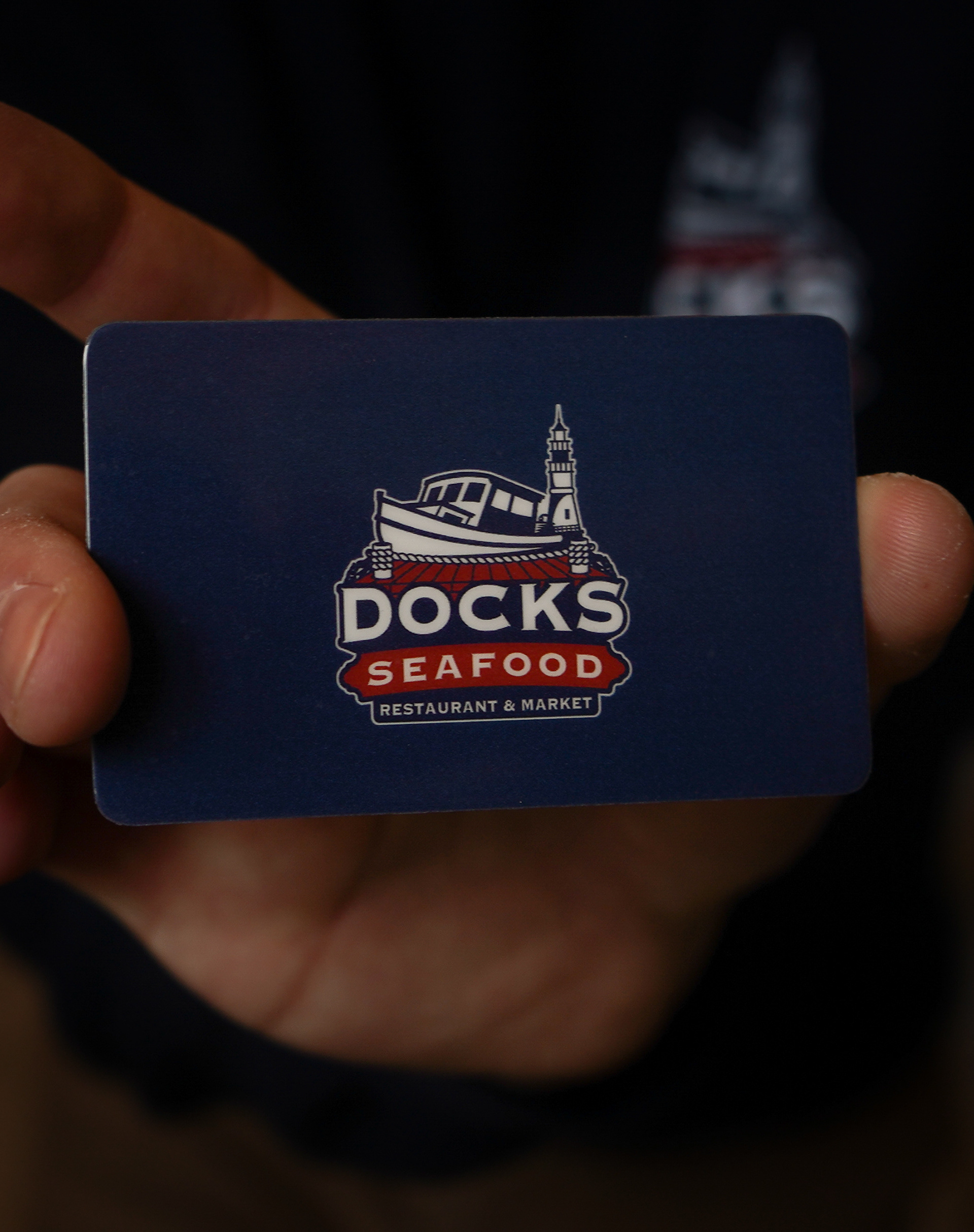
Gift Card
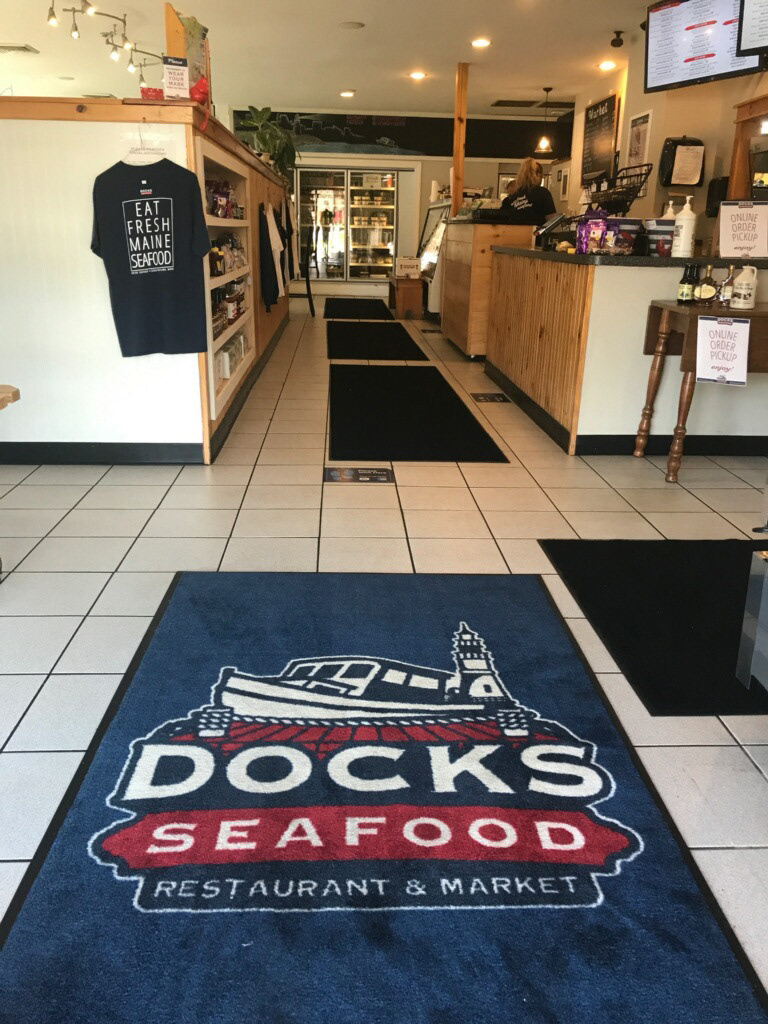
Entry Rug
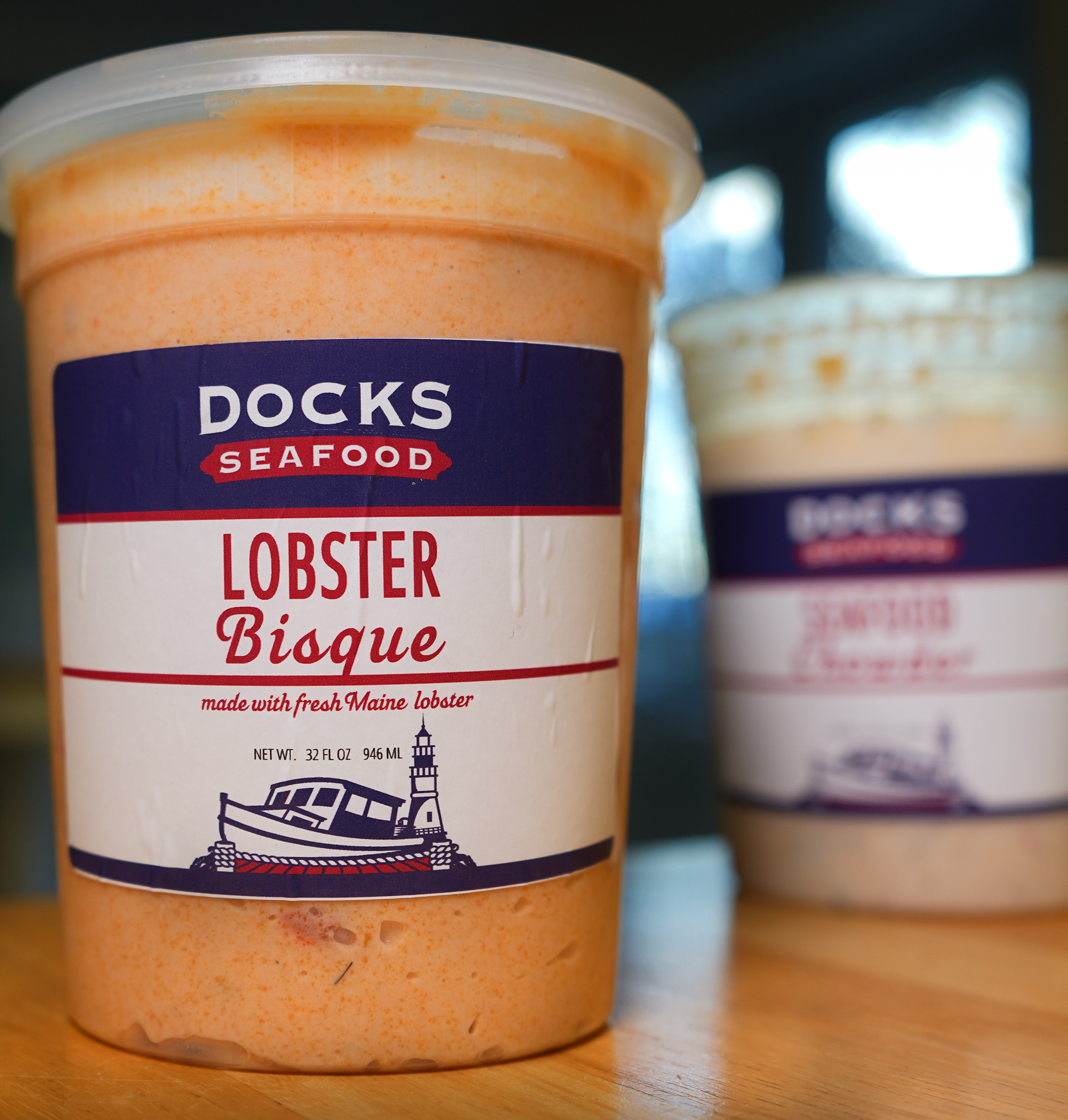
Labels
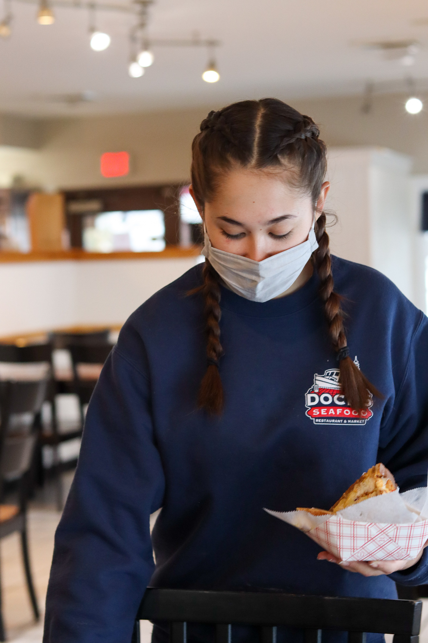
Employee Uniform
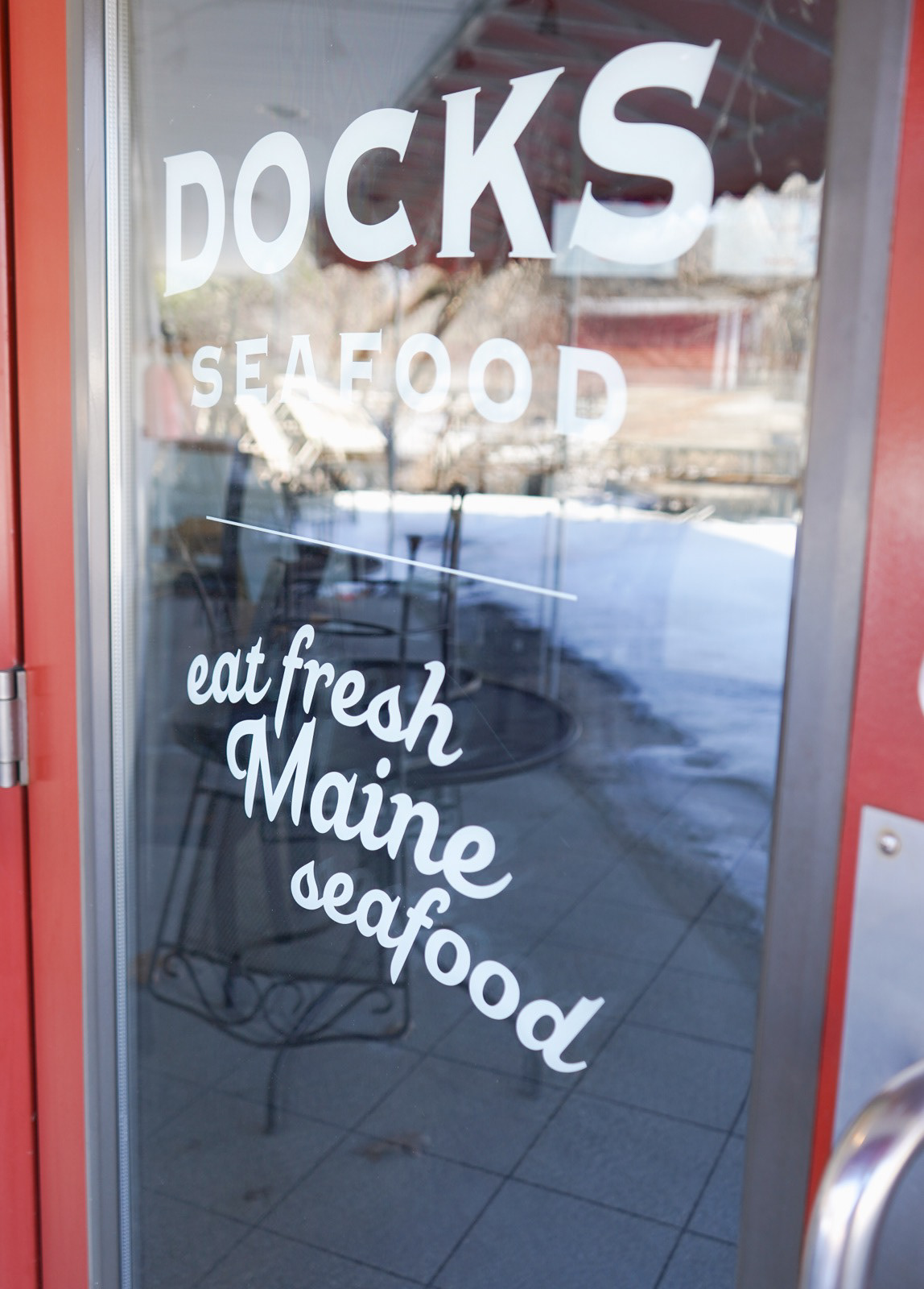
Front Door
Photos | Austin Mills 2020-2021
CREATIVE PROCESS - TIMELINE
February 12, 2020 - Research conducted and completed.
February 14, 2020 - Mood board completion and the review process.
February 21, 2020 thru March 14, 2020 - Concept sketching and the review process.
March 19, 2020 thru March 25, 2020 - Designed and delivered four proofs & the review process.
March 31, 2020 thru April 2, 2020 - Final proof edits & proof review & proof approval.
April 3, 2020 - Formatted the logo for print purposes and trapped the colors.
April 5, 2020 thru April 6, 2020 - Created the production files, compiled them, and delivered.
April 9, 2020 thru April 10, 2020 - Created and delivered the Visual Identity Guide.
MURAL
September 2022 - Austin approached me asking to have artwork I sold to them earlier in the year reformatted into a mural that they wished to have installed as an addition to their bar. After three rounds of revisions, I completed the mural design which has acted as key artwork that Docks Seafood has based advertising around and engagement with their community through social media especially. You can really see how far the team at Docks Seafood has come since we started working together. They have done an excellent job pushing their branding with beautiful interior and exterior use that showcases their love and care for the community they support and are supported by. Docks breathes that coastal/nautical family friendly environment which is attractive and allows their customers to experience eating fresh seafood in an authentic, modern, yet traditional Maine seafood restaurant. See their branding brought to life on their website, Instagram and on Facebook.
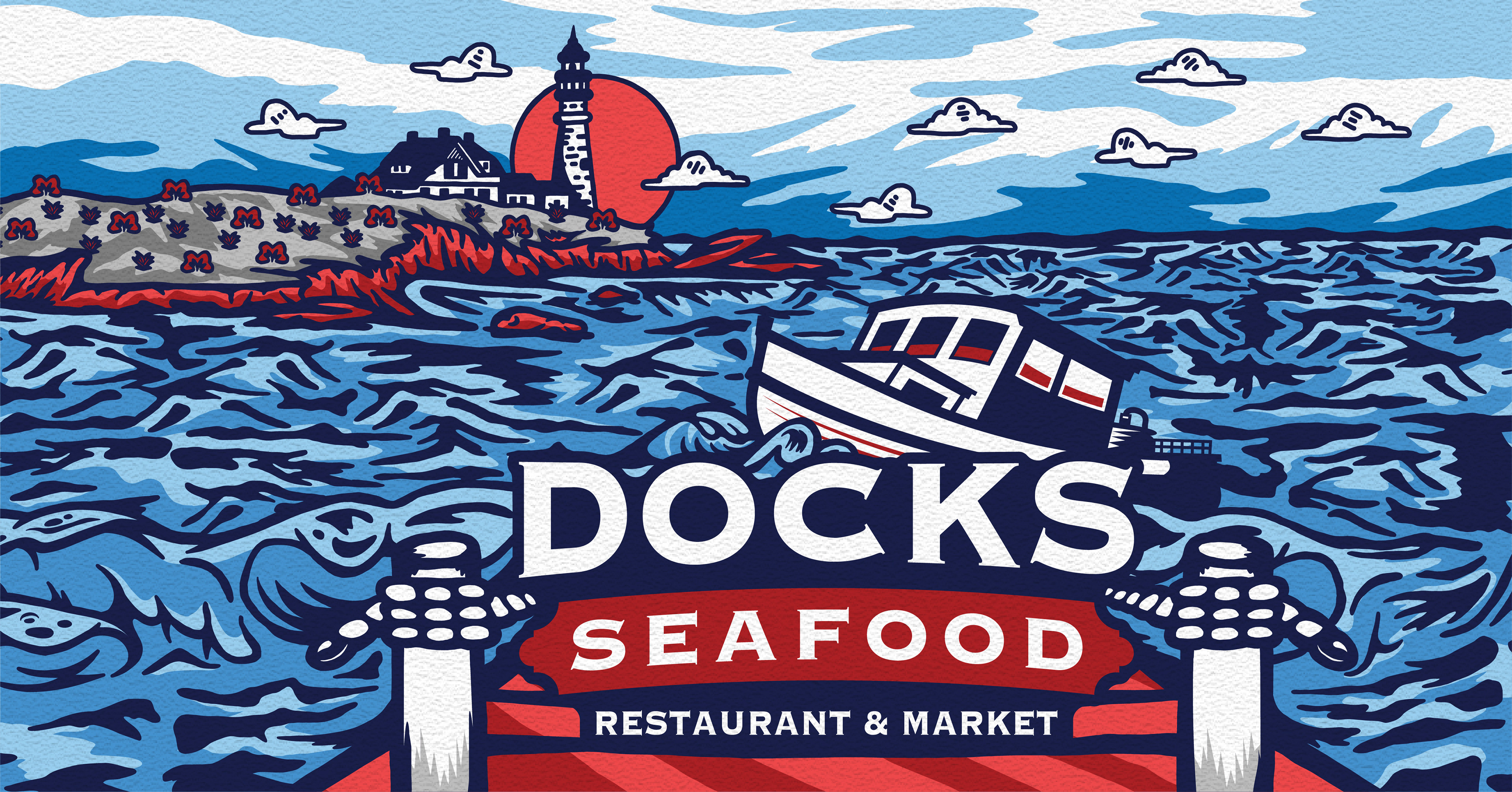
Illustration and wall texture applied
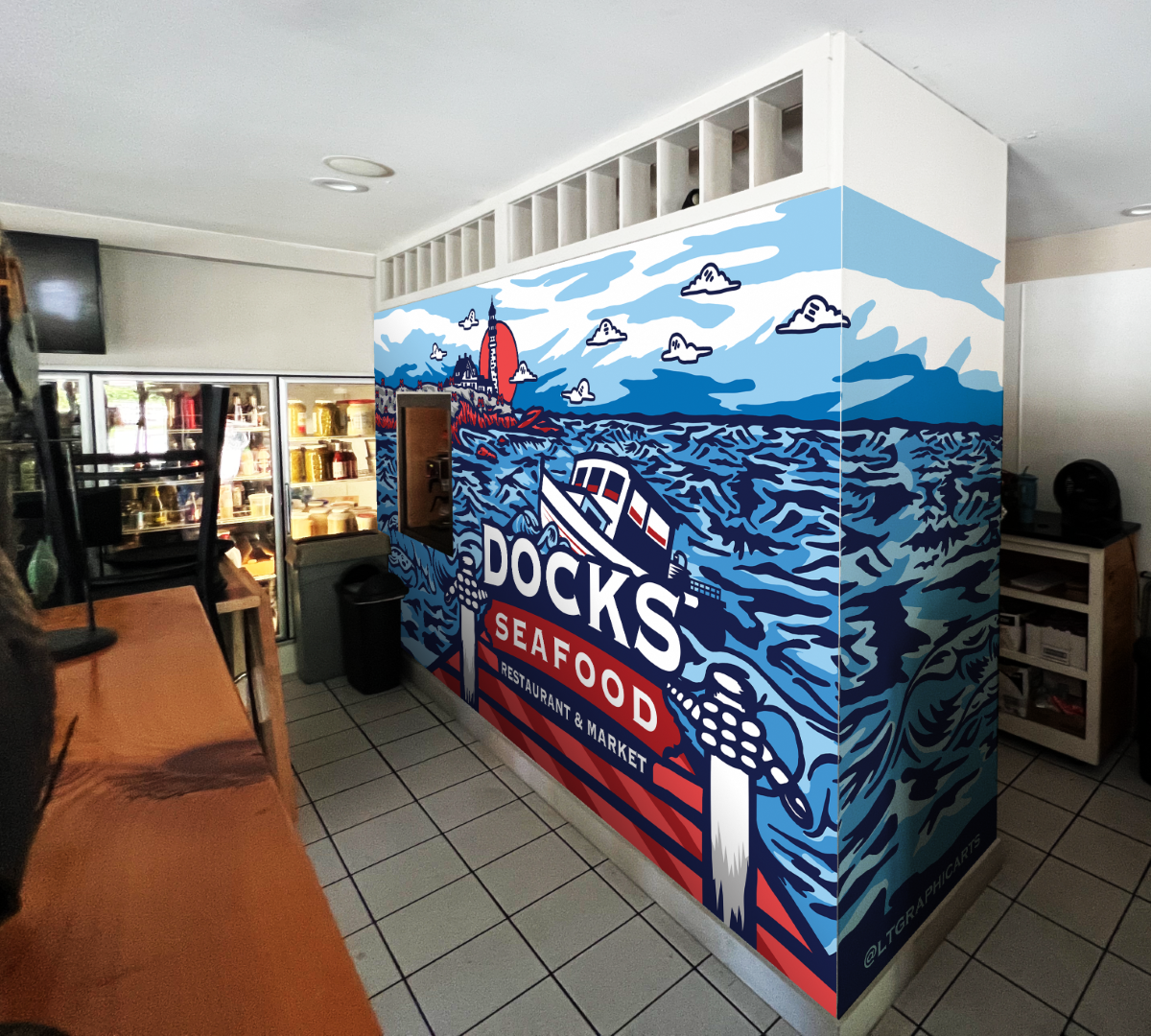
Mural Mockup
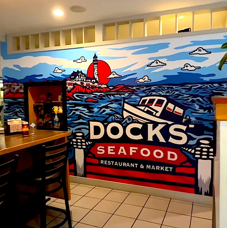
Mural
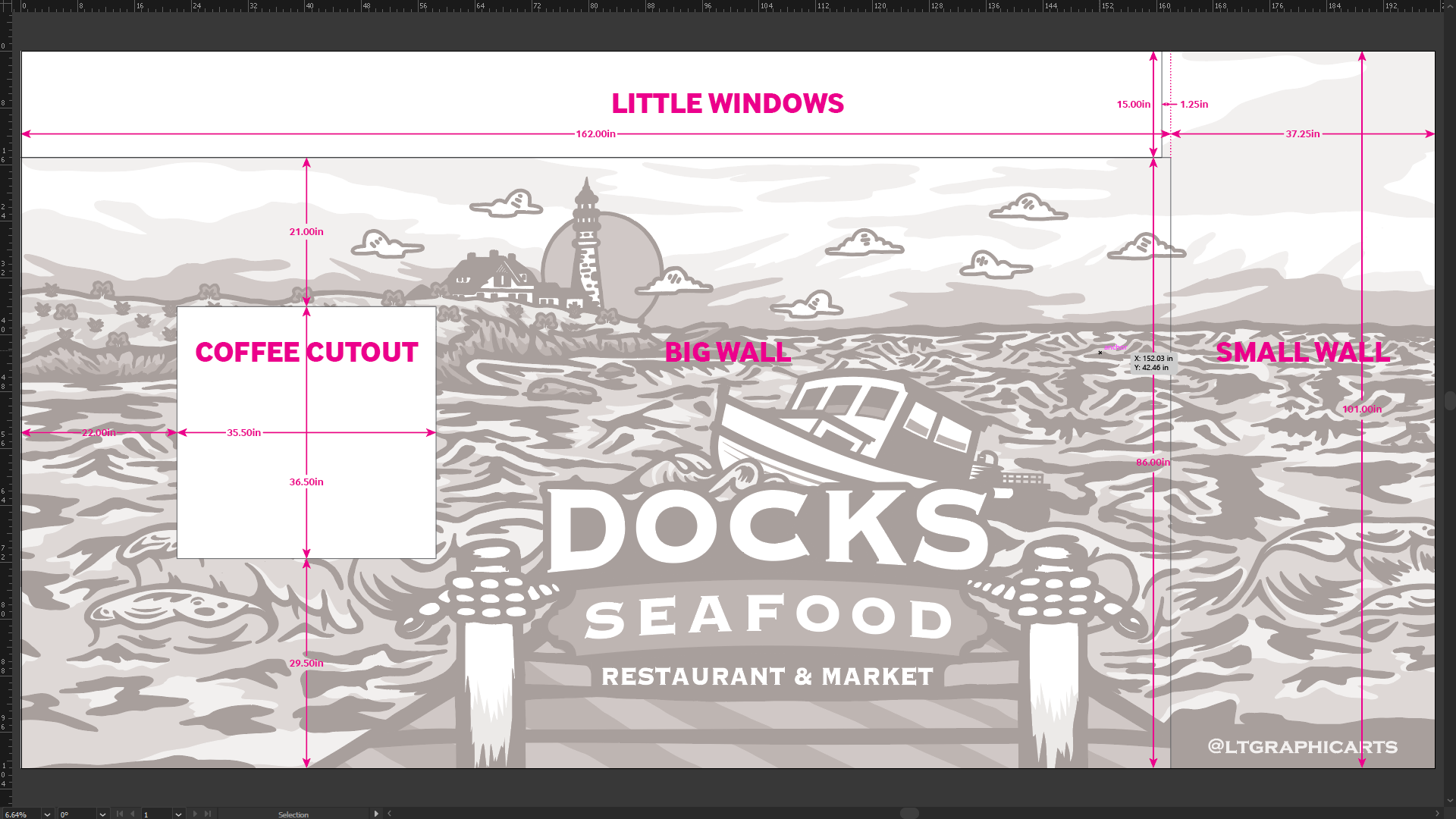
Dimensions, Trim and Fold Line Rendering
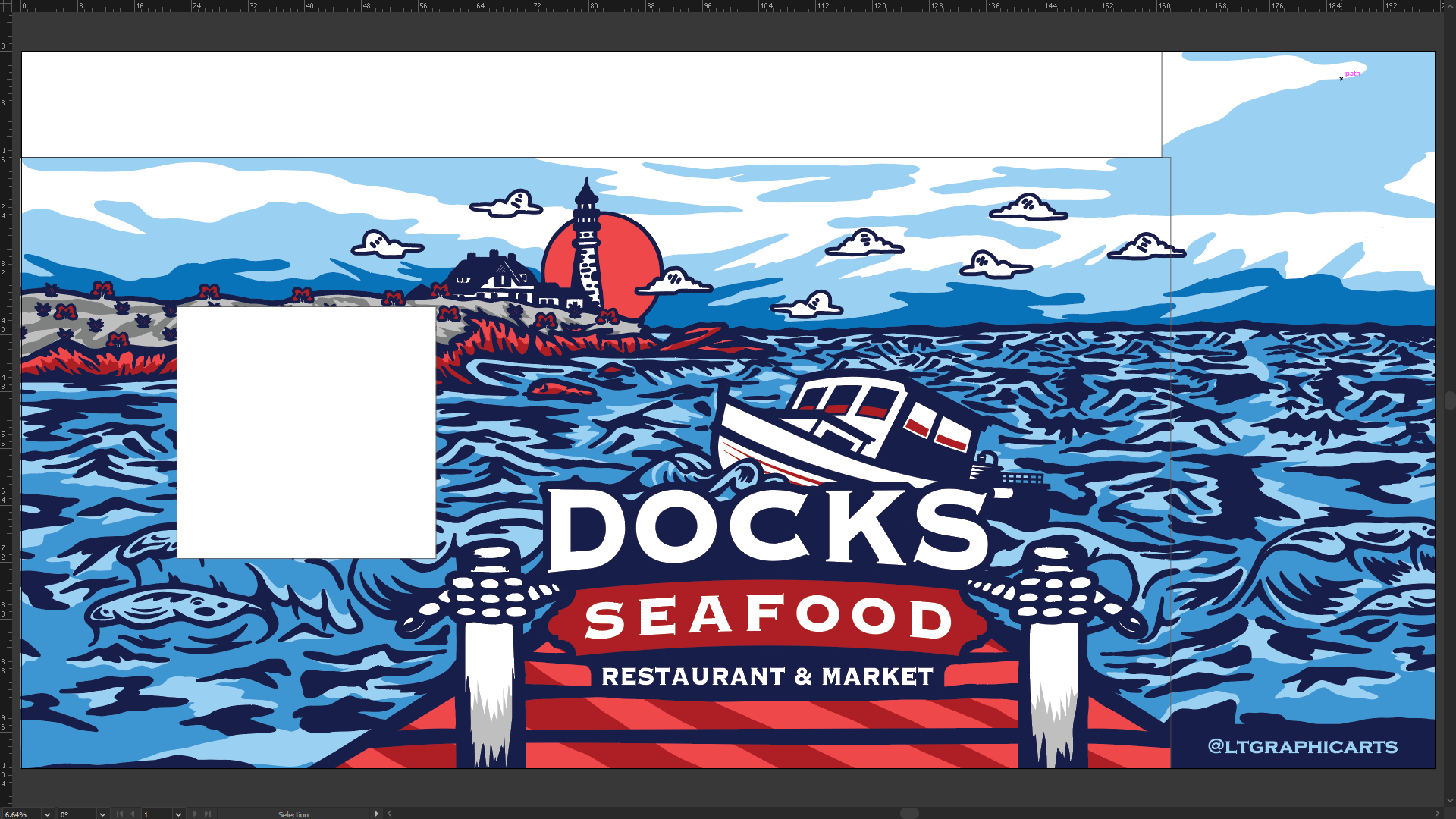
Trim and Fold Line Rendering

Art Rendering
TESTIMONIAL
"I recommend Luke to any individual or business that is looking to enhance their brand. Not only is Luke clear when it comes to his design timeline, but he also makes sure that customer satisfaction is the number one priority. I was beyond impressed with the final logo he created for my family's restaurant, and truly believe that it represents who we are. Luke even made sure that other marketing material designed in-house would be consistent to what he had designed, and supplied me with documents to reference in the future when creating marketing content. We have already received many compliments on our new image, and am sure we will receive many more. He is highly skilled, honest, professional and provides a refreshingly friendly and optimistic outlook in an often over-saturated and stressful industry. I will be going back to Luke in the future."
Austin Mills
Marketing Manager

