CREATIVE BRIEF
Massachusetts has a lot of the best high school sports teams in New England. Franklin High School adds to the equation with it's stellar programs especially shown in the girl's volleyball team. My cousin has a daughter who competes on the team, and he approached me with the opportunity to design a custom logo for merchandise that they would like to sell through the booster club at the school. Originally when setting up the online store, he told me that they offered graphic services but the results didn't meet my cousins specifications. He showed me a few logos off google that he and his family liked and said he wanted their logo to be fierce and reflect the school colors (Navy Blue, Carolina Blue, and White).
COLORS
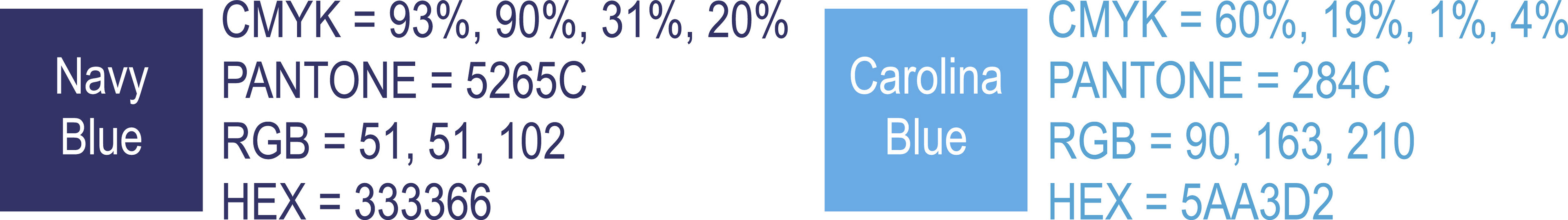
My first step was to find my colors and create my palette. I researched the light blue used by the University of North Carolina and noted it's hex code, RGB, and CMYK formulas. Afterwards, I looked up Navy Blue hex codes, RGB, and CMYK formulas and found one that would look good paired up with the Carolina Blue. White would be used as the under base color that would show up underneath the other two blues. The white is designed to act as an outline or border around the rest of the design which is essential in making the design adaptable on both light and dark backgrounds. It can also be used in print production as an under base when screen printing on shirts, and hoodies. White borders/outline could act as the cut line when creating labels or stickers to put onto items like a water bottle for example. Last but not least, the white color could be an essential part of stitching an embroidered hat that allows the design to pop-out with a 3D Puff Stitch applied. See my color palette below.
FONTS
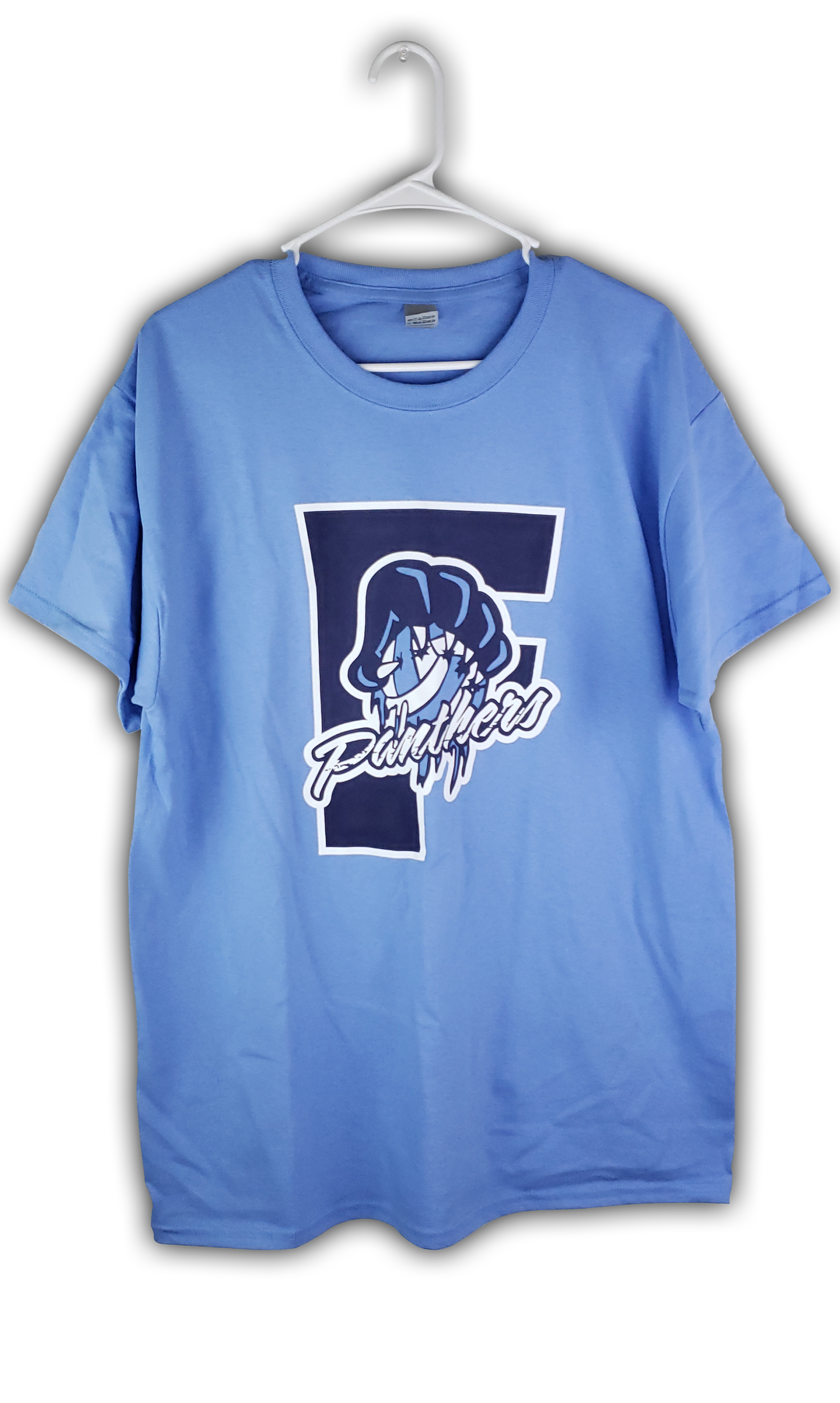
Each of these two fonts were picked for their own reasons. Monserrat Black is very similar to the font used to create one of Franklin High School's official logos. That letter mark shows a sans-serif letter "F" with one half of the panther's face contained inside the letterform. Sarah Script Regular shows elegance in the swoops and curls that form the script typeface. I saw this as a script typeface that represented the swiftness, grace, and sharpness of a panther attack that lies under the bold and grounded sans-serif Monserrat Black font.

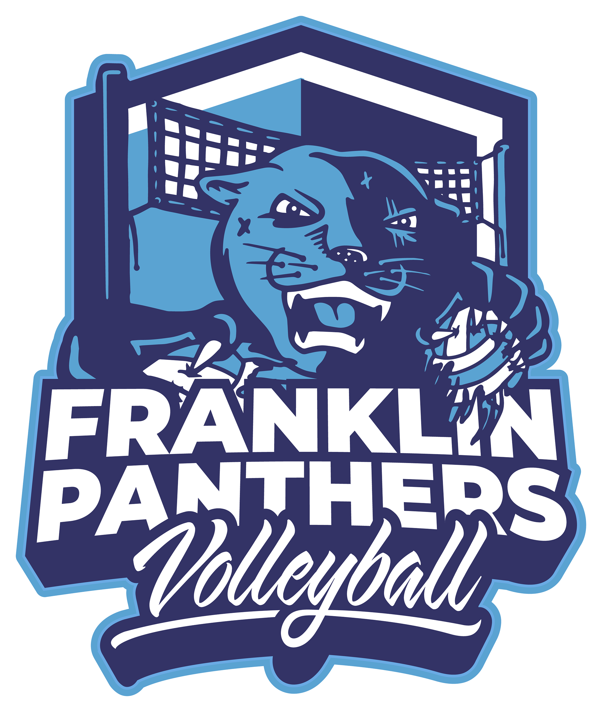
ILLUSTRATION
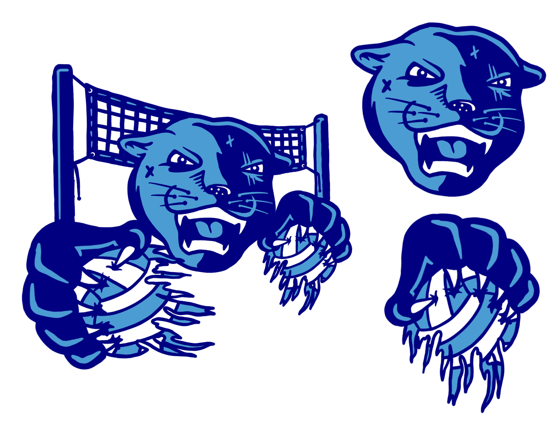
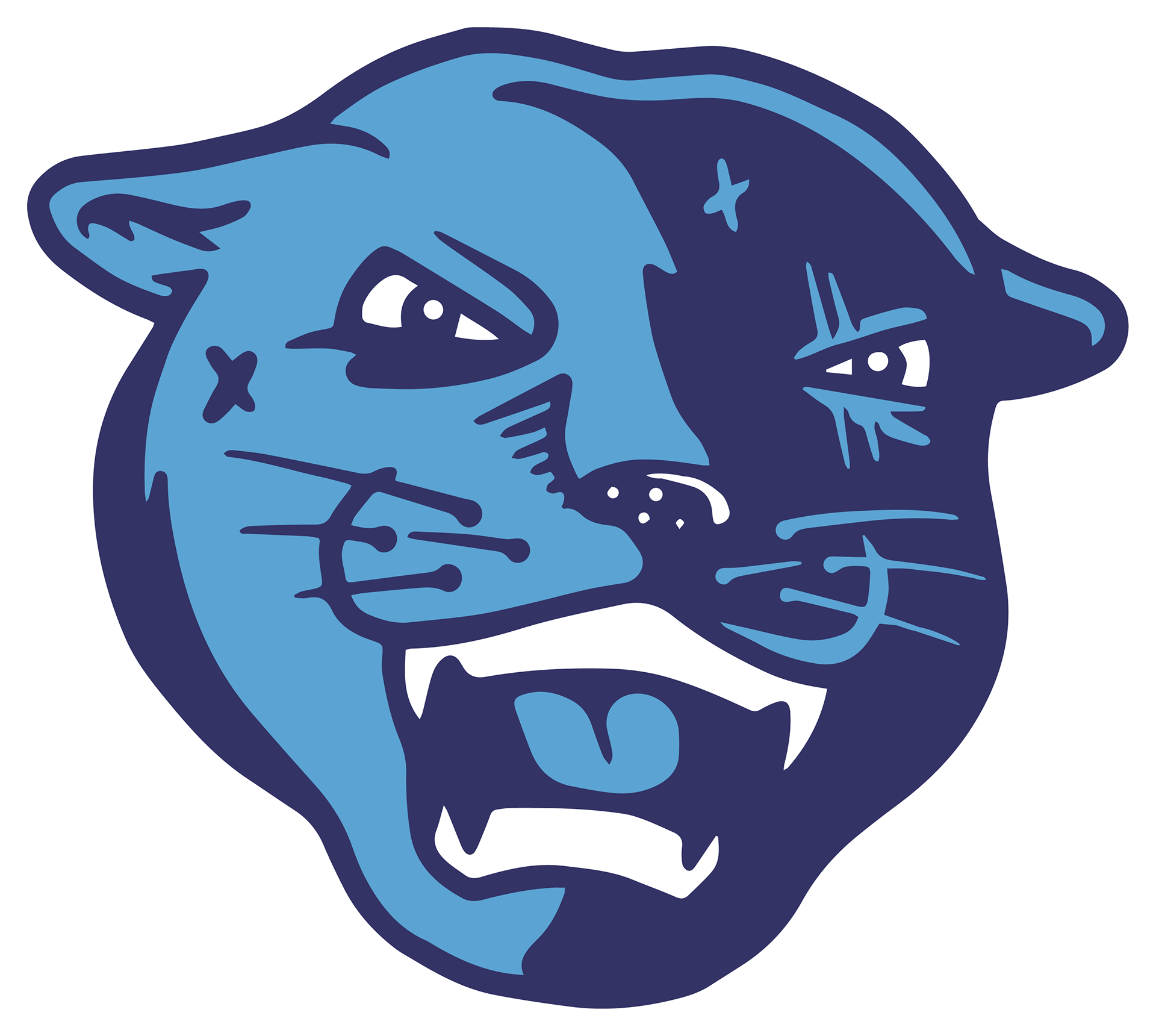
A panther like this one needs to show that it's experienced in a fight and that the state championships that have been won have come from grit and focus. My illustrated panther head displays scars that shows the experience and that it has been battle tested throughout the volleyball team's history. The paws are positioned around the panther head in a way that tells the opponent to "square up" and be ready to fight for the match win even if you get tattered and bruised like the volleyball ripped apart in the design. As for the volleyball net, it's supposed to be representative of the sport and with it's perspective set it's supposed to give the design more depth. My shield I designed is supposed to mimic the shield used in the official logo used by the school.
LOGO DESIGNS
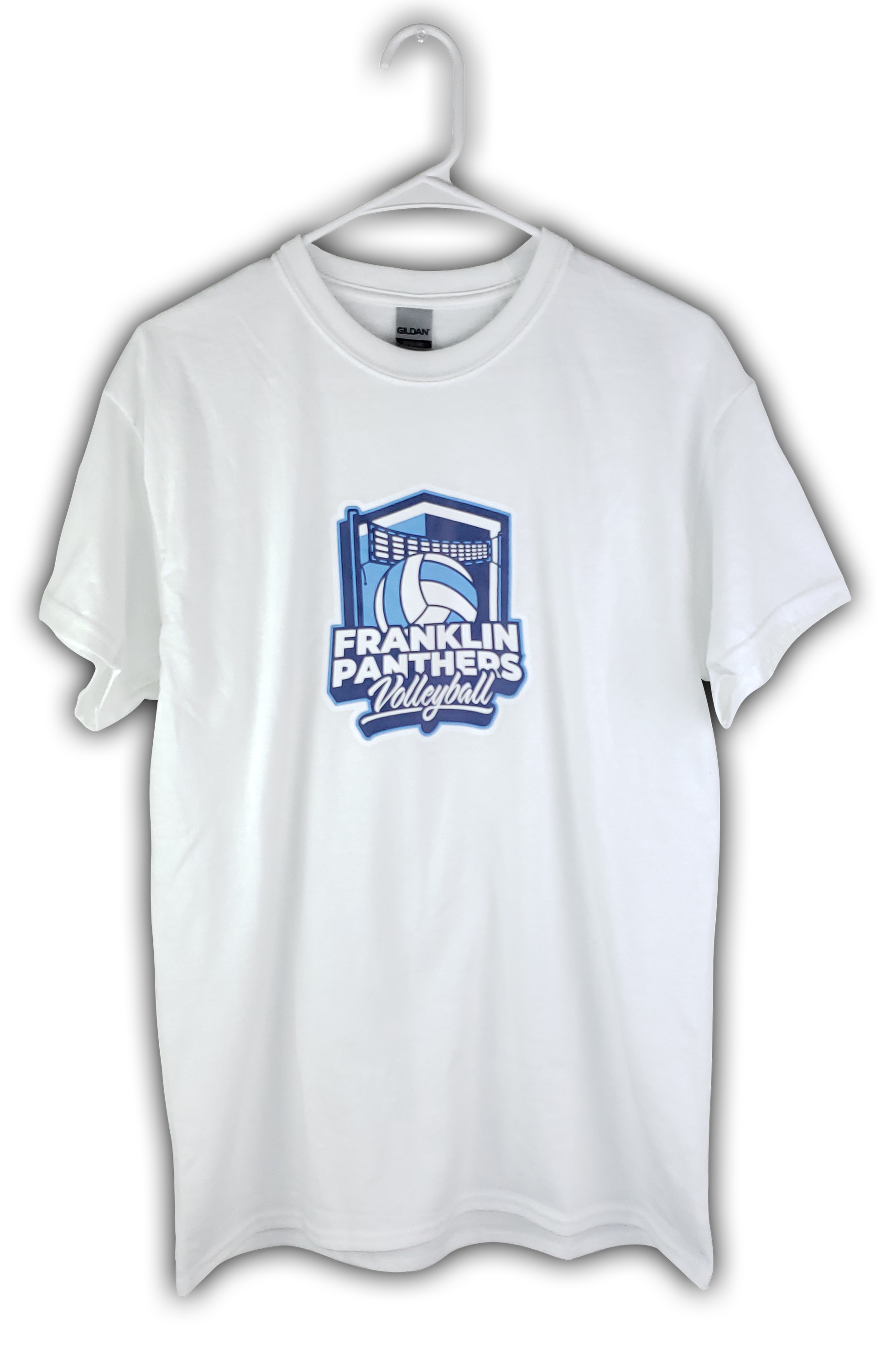
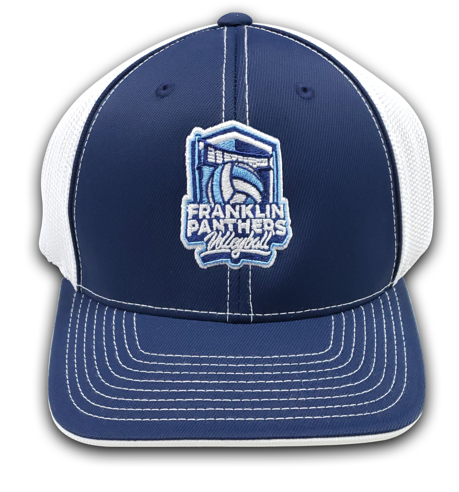
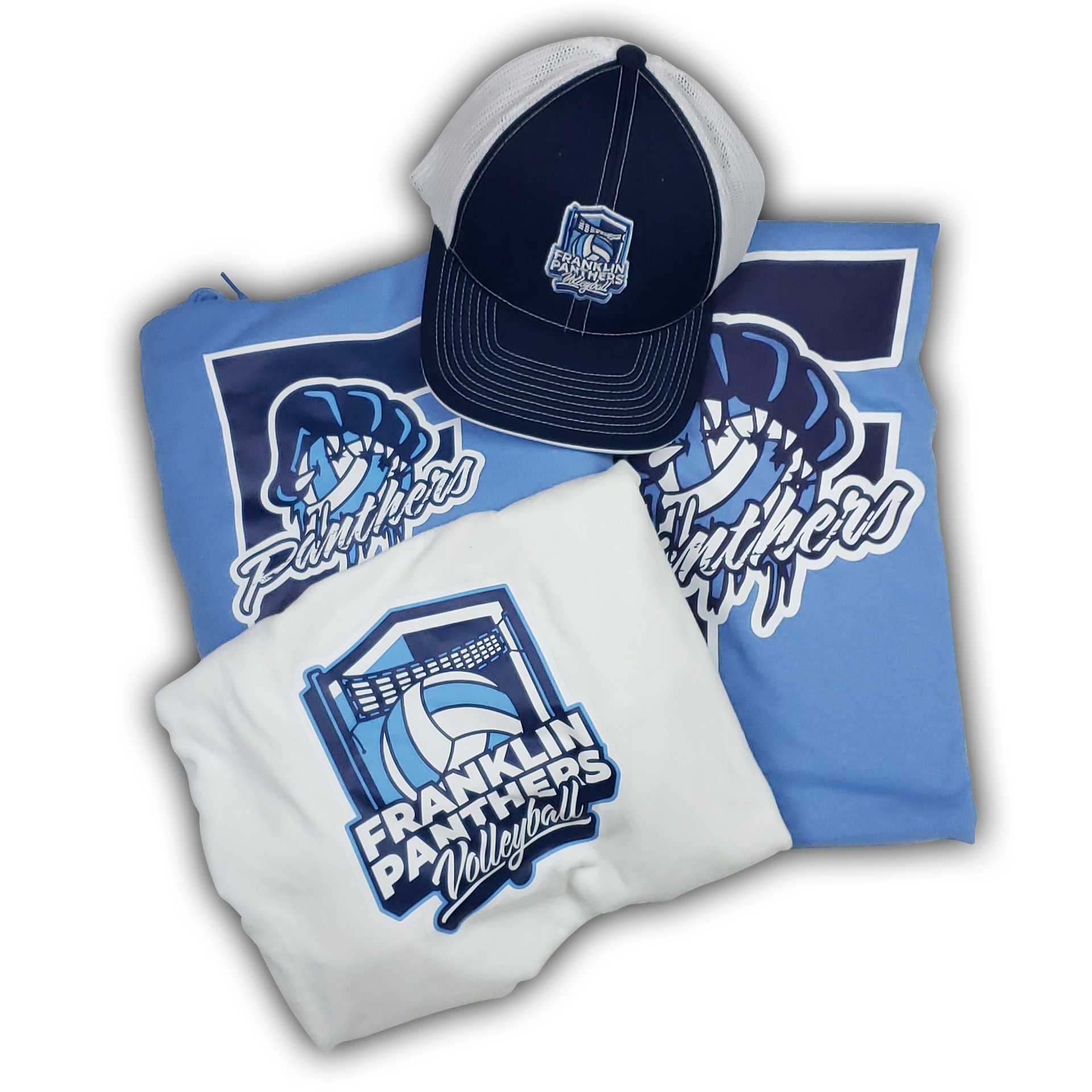
When I manipulated the fonts together, and combined them with the illustration, I was sold on the fact that everything about the final designs represented the volleyball team very well. The representation shown was of fierceness, and being bold when a game is on the line while staying grounded and not reckless in defending attacks. I could imagine a battle tested panther ready for the opportunity to make the kill just like in the remaining minutes of a nail-biting last set!
Mascot
Badge

Lettermark
DESIGN PROCESS
1.) Sketching & Illustration - Procreate on the iPad
2.) Logo Designs - Adobe Illustrator
3.) Mockups - Adobe Photoshop
4.) Video - Adobe After Effects & Adobe Premiere Pro
GIFTS & TESTIMONIAL
Below are the final designs I completed on merchandise that was sent to me.